Analyzing CITE-seq data
Author: Isaac Virshup
[1]:
import scanpy as sc
import numpy as np
import pandas as pd
import seaborn as sns
import matplotlib as mpl
[2]:
sc.logging.print_versions()
sc.set_figure_params(frameon=False, figsize=(4, 4))
scanpy==1.4.5.2.dev45+g890bc1e.d20200319 anndata==0.7.2.dev24+g669dd44 umap==0.4.0rc1 numpy==1.18.1 scipy==1.4.1 pandas==1.0.1 scikit-learn==0.22.2.post1 statsmodels==0.11.1 python-igraph==0.8.0 louvain==0.6.1
Reading
[3]:
# !mkdir -p data
# !wget http://cf.10xgenomics.com/samples/cell-exp/3.1.0/5k_pbmc_protein_v3_nextgem/5k_pbmc_protein_v3_nextgem_filtered_feature_bc_matrix.h5 -O data/5k_pbmc_protein_v3_nextgem_filtered_feature_bc_matrix.h5
[4]:
datafile = "data/5k_pbmc_protein_v3_nextgem_filtered_feature_bc_matrix.h5"
[5]:
pbmc = sc.read_10x_h5(datafile, gex_only=False)
pbmc.var_names_make_unique()
pbmc.layers["counts"] = pbmc.X.copy()
sc.pp.filter_genes(pbmc, min_counts=1)
pbmc
[5]:
AnnData object with n_obs × n_vars = 5527 × 21453
    var: 'gene_ids', 'feature_types', 'genome', 'n_counts'
    layers: 'counts'
[6]:
pbmc.var["feature_types"].value_counts()
[6]:
Gene Expression     21421
Antibody Capture       32
Name: feature_types, dtype: int64
Preprocessing
For ease of preprocessing, we’ll split the data into seperate protein and RNA AnnData objects:
[7]:
protein = pbmc[:, pbmc.var["feature_types"] == "Antibody Capture"].copy()
rna = pbmc[:, pbmc.var["feature_types"] == "Gene Expression"].copy()
[8]:
rna.shape
[8]:
(5527, 21421)
[9]:
pbmc.shape
[9]:
(5527, 21453)
Protein
First we’ll take a look at the antibody counts.
We still need to explain the function here. I’m happy if we add it to the first tutorial, too (I know you did it already at some point, but I didn’t want to let go of the simpler naming scheme back then; now I’d be happy to transition.)
[10]:
protein.var["control"] = protein.var_names.str.contains("control")
sc.pp.calculate_qc_metrics(
    protein,
    percent_top=(5, 10, 15),
    var_type="antibodies",
    qc_vars=("control",),
    inplace=True,
)
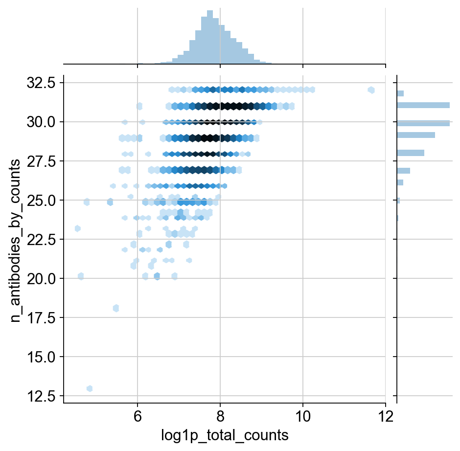
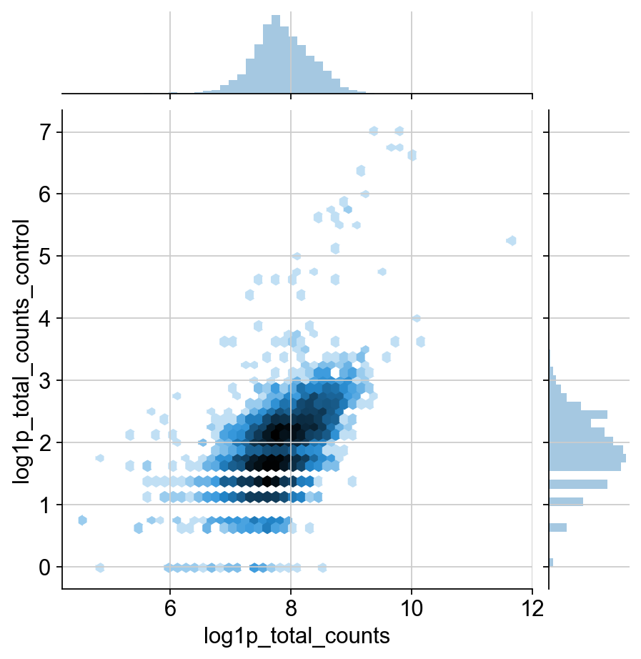
We can look check out the qc metrics for our data:
TODO: I would like to include some justification for the change in normalization. It definitley has a much different distribution than transcripts. I think this could be shown through the qc plots, but it’s a huge pain to move around these matplotlib plots. This might be more appropriate for the in-depth guide though.
Agreed! But, having an explanation of the two images below is also a good first step. Also nice to contrast it with the corresponding RNA distributions.
[11]:
sns.jointplot("log1p_total_counts", "n_antibodies_by_counts", protein.obs, kind="hex", norm=mpl.colors.LogNorm())
sns.jointplot("log1p_total_counts", "log1p_total_counts_control", protein.obs, kind="hex", norm=mpl.colors.LogNorm())
[11]:
<seaborn.axisgrid.JointGrid at 0x1410d7f90>
[12]:
protein.layers["counts"] = protein.X.copy()
Discuss that this here is a different normalization.
[13]:
sc.pp.normalize_geometric(protein)
sc.pp.log1p(protein)
[14]:
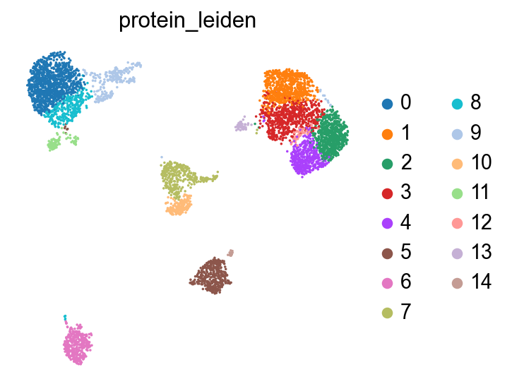
sc.pp.pca(protein, n_comps=20)
sc.pp.neighbors(protein, n_neighbors=30)  # why can't we just work with the default neighbors?
sc.tl.leiden(protein, key_added="protein_leiden")
[15]:
# TODO: remove
protein.obsp["protein_connectivities"] = protein.obsp["connectivities"].copy()
sc.tl.umap(protein)
sc.pl.umap(protein, color="protein_leiden", size=10)
[16]:
protein
[16]:
AnnData object with n_obs × n_vars = 5527 × 32
    obs: 'n_antibodies_by_counts', 'log1p_n_antibodies_by_counts', 'total_counts', 'log1p_total_counts', 'pct_counts_in_top_5_antibodies', 'pct_counts_in_top_10_antibodies', 'pct_counts_in_top_15_antibodies', 'total_counts_control', 'log1p_total_counts_control', 'pct_counts_control', 'protein_leiden'
    var: 'gene_ids', 'feature_types', 'genome', 'n_counts', 'control', 'n_cells_by_counts', 'mean_counts', 'log1p_mean_counts', 'pct_dropout_by_counts', 'total_counts', 'log1p_total_counts'
    uns: 'log1p', 'pca', 'neighbors', 'leiden', 'umap', 'protein_leiden_colors'
    obsm: 'X_pca', 'X_umap'
    varm: 'PCs'
    layers: 'counts'
    obsp: 'distances', 'connectivities', 'protein_connectivities'
RNA
Now we’ll process our RNA in the typical way:
[17]:
# sc.pp.filter_genes(rna, min_counts=1)

rna.var["mito"] = rna.var_names.str.startswith("MT-")
sc.pp.calculate_qc_metrics(rna, qc_vars=["mito"], inplace=True)
Yes, would be great to the see the QC plots, here, too. Are cells with low counts etc. weird only on the RNA level or also on the protein level? It’d be nice to see the QC plots side-by-side between RNA and protein, I’d say.
[18]:
rna.layers["counts"] = rna.X.copy()
[19]:
sc.pp.normalize_total(rna)
sc.pp.log1p(rna)
[20]:
sc.pp.pca(rna)
sc.pp.neighbors(rna, n_neighbors=30)   # why can't we just work with the default neighbors?
sc.tl.umap(rna)
sc.tl.leiden(rna, key_added="rna_leiden")
Visualization
An alternative would be to recombine the data into the pbmc object here.
[21]:
rna.obsm["protein"] = protein.to_df()
rna.obsm["protein_umap"] = protein.obsm["X_umap"]
rna.obs["protein_leiden"] = protein.obs["protein_leiden"]
rna.obsp["rna_connectivities"] = rna.obsp["connectivities"].copy()
rna.obsp["protein_connectivities"] = protein.obsp["protein_connectivities"]
[22]:
sc.tl.umap(rna)
[23]:
sc.pl.umap(rna, color=["rna_leiden", "protein_leiden"], size=10)
sc.pl.embedding(rna, basis="protein_umap", color=["rna_leiden", "protein_leiden"], size=10)
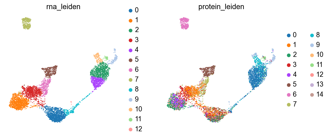
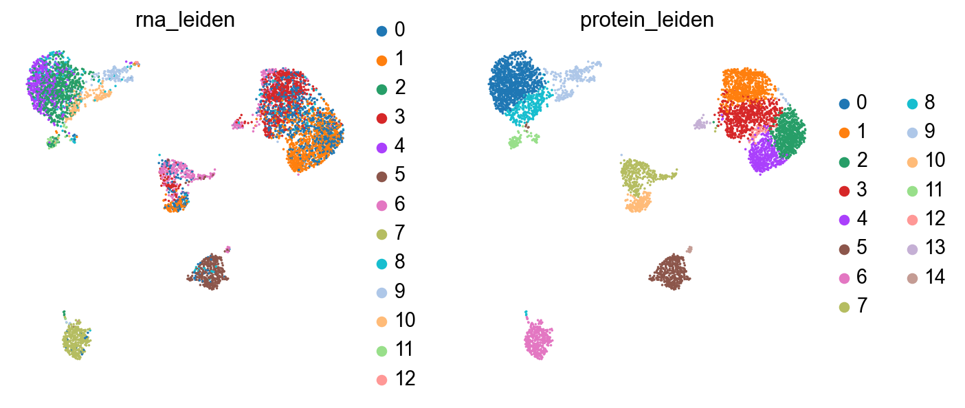
The clusterings disagree quite a bit. It looks like neither modality is giving a full accounting of the data, so now we’ll see what we can learn by combining the modalities.
Plotting values between modalities
- TODO: Get selectors like this working in scanpy.
Imports and helper functions
[24]:
import altair as alt
from functools import partial

alt.renderers.enable("png")
alt.data_transformers.disable_max_rows()
[24]:
DataTransformerRegistry.enable('default')
[25]:
def embedding_chart(df: pd.DataFrame, coord_pat: str, *, size=5) -> alt.Chart:
    """Make schema for coordinates, like sc.pl.embedding."""
    x, y = df.columns[df.columns.str.contains(coord_pat)]
    return (
        alt.Chart(plotdf, height=300, width=300)
        .mark_circle(size=size)
        .encode(
            x=alt.X(x, axis=None),
            y=alt.Y(y, axis=None),
        )
    )

def umap_chart(df: pd.DataFrame, **kwargs) -> alt.Chart:
    """Like sc.pl.umap, but just the coordinates."""
    return embedding_chart(df, "umap", **kwargs)

def encode_color(c: alt.Chart, col: str, *, qdomain=(0, 1), scheme: str = "lightgreyred") -> alt.Chart:
    """Add colors to an embedding plot schema."""
    base = c.properties(title=col)
    if pd.api.types.is_categorical(c.data[col]):
        return base.encode(color=col)
    else:
        return base.encode(
            color=alt.Color(
                col,
                scale=alt.Scale(
                    scheme=scheme,
                    clamp=True,
                    domain=list(c.data[col].quantile(qdomain)),
                    nice=True,
                )
            )
        )
[26]:
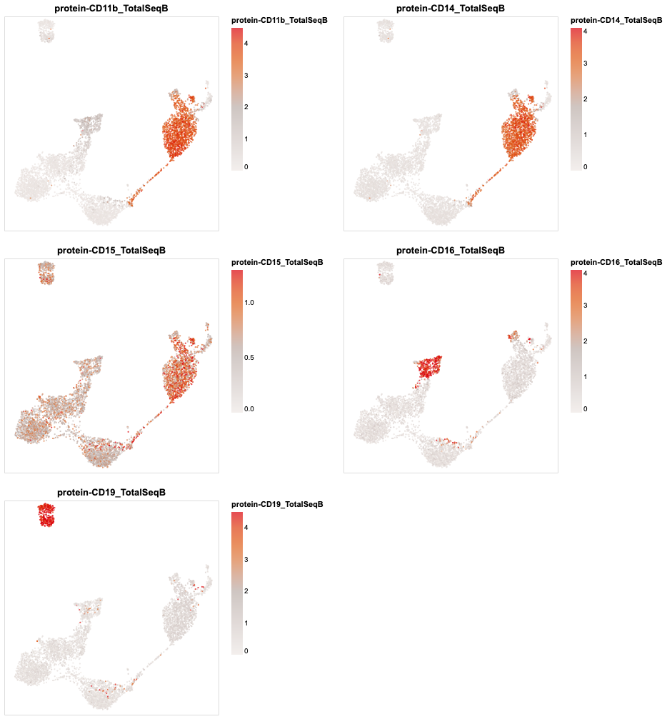
plotdf = sc.get.obs_df(
    rna,
    obsm_keys=[("X_umap", i) for i in range(2)] + [("protein", i) for i in rna.obsm["protein"].columns]
)
(
    alt.concat(
        *map(partial(encode_color, umap_chart(plotdf), qdomain=(0, .95)), plotdf.columns[5:10]),
        columns=2
    )
    .resolve_scale(color='independent')
    .configure_axis(grid=False)
)
[26]:
Clustering
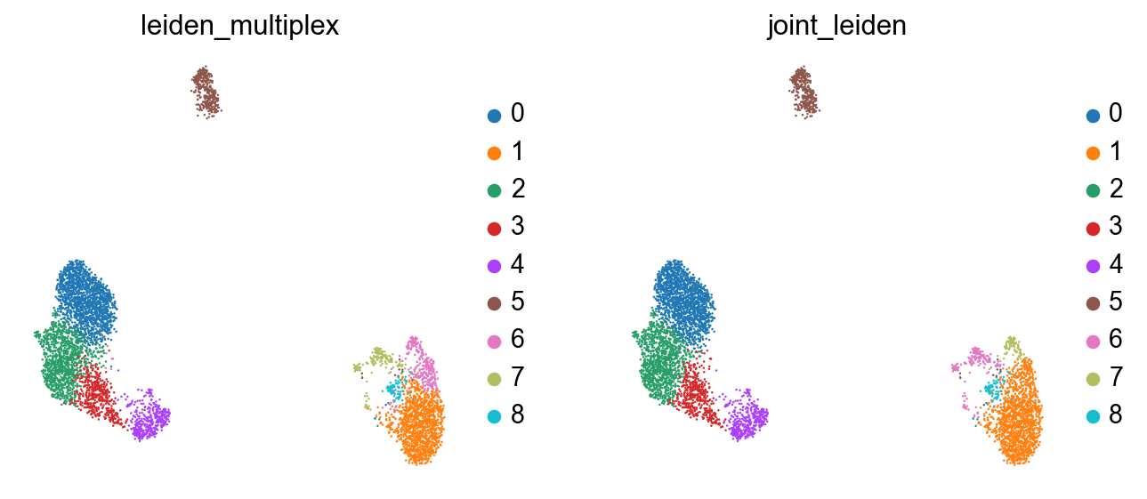
Here, we have a few approaches for clustering. Both which take into account both modalities of the data. First, we can use both connectivity graphs generated from each assay.
[27]:
sc.tl.leiden_multiplex(rna, ["rna_connectivities", "protein_connectivities"]) # Adds key "leiden_multiplex" by default
Alternativley, we can try and combine these representations into a joint graph.
[28]:
def join_graphs_max(g1: "sparse.spmatrix", g2: "sparse.spmatrix"):
    """Take the maximum edge value from each graph."""
    out = g1.copy()
    mask = g1 < g2
    out[mask] = g2[mask]

    return out
[29]:
rna.obsp["connectivities"] = join_graphs_max(rna.obsp["rna_connectivities"], rna.obsp["protein_connectivities"])
[30]:
sc.tl.leiden(rna, key_added="joint_leiden")
[31]:
sc.tl.umap(rna)
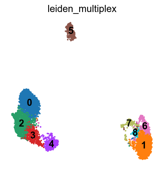
Now we’ve got a clustering which better represents both modalities in the data:
[32]:
sc.pl.umap(rna, color=["leiden_multiplex", "joint_leiden"], size=5)
[33]:
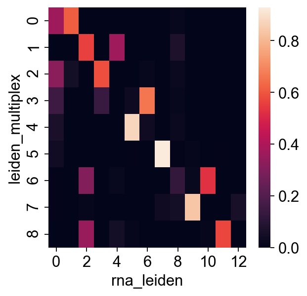
sns.heatmap(pd.crosstab(rna.obs["leiden_multiplex"], rna.obs["rna_leiden"], normalize="index"))
[33]:
<matplotlib.axes._subplots.AxesSubplot at 0x1364e29d0>
[34]:
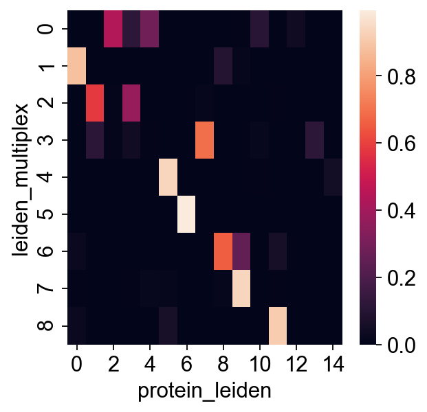
sns.heatmap(pd.crosstab(rna.obs["leiden_multiplex"], rna.obs["protein_leiden"], normalize="index"))
[34]:
<matplotlib.axes._subplots.AxesSubplot at 0x13714f890>
Gather data
[36]:
pbmc.X[:, (pbmc.var["feature_types"] == "Gene Expression").values] = rna.X
[37]:
pbmc.X[:, (pbmc.var["feature_types"] == "Antibody Capture").values] = protein.X
[38]:
pbmc.obsm.update(rna.obsm)
[39]:
pbmc.obs[rna.obs.columns] = rna.obs
[40]:
pbmc
[40]:
AnnData object with n_obs × n_vars = 5527 × 21453
    obs: 'n_genes_by_counts', 'log1p_n_genes_by_counts', 'total_counts', 'log1p_total_counts', 'pct_counts_in_top_50_genes', 'pct_counts_in_top_100_genes', 'pct_counts_in_top_200_genes', 'pct_counts_in_top_500_genes', 'total_counts_mito', 'log1p_total_counts_mito', 'pct_counts_mito', 'rna_leiden', 'protein_leiden', 'leiden_multiplex', 'joint_leiden'
    var: 'gene_ids', 'feature_types', 'genome', 'n_counts'
    obsm: 'X_pca', 'X_umap', 'protein', 'protein_umap'
    layers: 'counts'
Labelling
[43]:
sc.pl.umap(pbmc, color="leiden_multiplex", legend_loc="on data")
[80]:
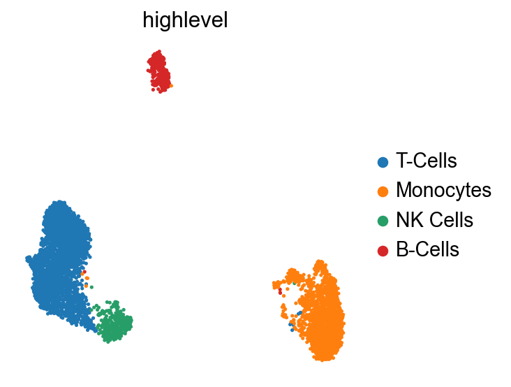
sc.tl.leiden(pbmc, resolution=0.3, key_added="highlevel") # I had to patch scanpy for this, but sergei's PR should make this work.
[82]:
highlevel_labels = {
    "0": "T-Cells",
    "1": "Monocytes",
    "2": "NK Cells",
    "3": "B-Cells",
}
pbmc.obs["highlevel"] = pbmc.obs["highlevel"].map(highlevel_labels)
[83]:
sc.pl.umap(pbmc, color="highlevel")
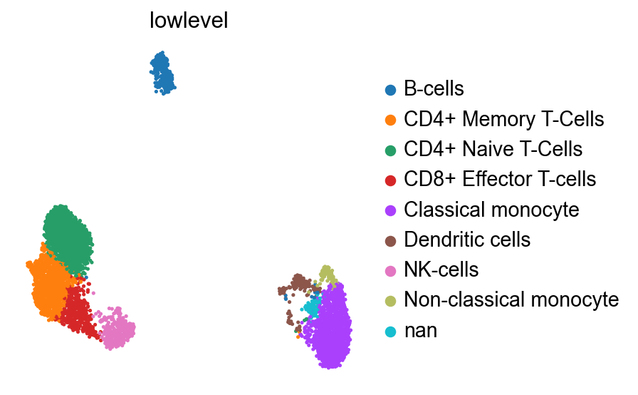
[203]:
joint_mapping = {
    "1": "Classical monocyte",
    "6": "Dendritic cells",
    "7": "Non-classical monocyte",
    "4": "NK-cells",
    "5": "B-cells",
    "3": "CD8+ Effector T-cells", # "CD8+, CCR7-, "CCL5+"
    "0": "CD4+ Naive T-Cells", # CD4+, CCR7+, CCL5-,
    "2": "CD4+ Memory T-Cells", # CD4+, CCR7-, CCL5+
    # I think 8 may be doublets since it's all the monocyte markers and all the t cell markers
}

pbmc.obs["lowlevel"] = pbmc.obs["joint_leiden"].map(joint_mapping)

sc.pl.umap(pbmc, color="lowlevel")
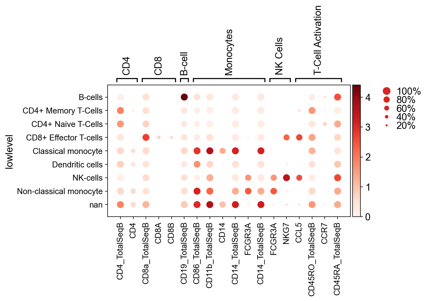
[201]:
markers = {
    "CD4": ["CD4_TotalSeqB", "CD4"],
    "CD8": ["CD8a_TotalSeqB", "CD8A", "CD8B"],
    "B-cell": ["CD19_TotalSeqB"],
    "Monocytes": ["CD86_TotalSeqB", "CD11b_TotalSeqB", "CD14", "CD14_TotalSeqB", "FCGR3A", "CD14_TotalSeqB"],
    "NK Cells": ["FCGR3A", "NKG7"],
    "T-Cell Activation": ["CCL5", "CD45RO_TotalSeqB", "CCR7", "CD45RA_TotalSeqB"],
}
[202]:
sc.pl.dotplot(  # Should we use z-scores for the hue in these?
    pbmc,
    markers,
    groupby="lowlevel",
)
[202]:
GridSpec(2, 5, height_ratios=[0.5, 10], width_ratios=[6.3, 0, 0.2, 0.5, 0.25])
[ ]: