Visualizing marker genes
[1]:
import scanpy as sc
import pandas as pd
from matplotlib import rcParams
[2]:
sc.set_figure_params(dpi=80, color_map='viridis')
sc.settings.verbosity = 2
sc.logging.print_versions()
scanpy==1.4.3+21.g63fbe58 anndata==0.6.19 umap==0.3.8 numpy==1.15.4 scipy==1.2.1 pandas==0.24.2 scikit-learn==0.20.3 statsmodels==0.9.0 python-igraph==0.7.1 louvain==0.6.1
Data was obtained from 10x PBMC 68k dataset (https://support.10xgenomics.com/single-cell-gene-expression/datasets). The dataset was filtered and a sample of 700 cells and 765 highly variable genes was kept.
For this data, PCA and UMAP are already computed. Also, louvain clustering and cell cycle detection are present in pbmc.obs.
[3]:
pbmc = sc.datasets.pbmc68k_reduced()
[4]:
pbmc
[4]:
AnnData object with n_obs × n_vars = 700 × 765
    obs: 'bulk_labels', 'n_genes', 'percent_mito', 'n_counts', 'S_score', 'G2M_score', 'phase', 'louvain'
    var: 'n_counts', 'means', 'dispersions', 'dispersions_norm', 'highly_variable'
    uns: 'bulk_labels_colors', 'louvain', 'louvain_colors', 'neighbors', 'pca', 'rank_genes_groups'
    obsm: 'X_pca', 'X_umap'
    varm: 'PCs'
To modify the default figure size, use rcParams.
[5]:
rcParams['figure.figsize'] = 4, 4
[6]:
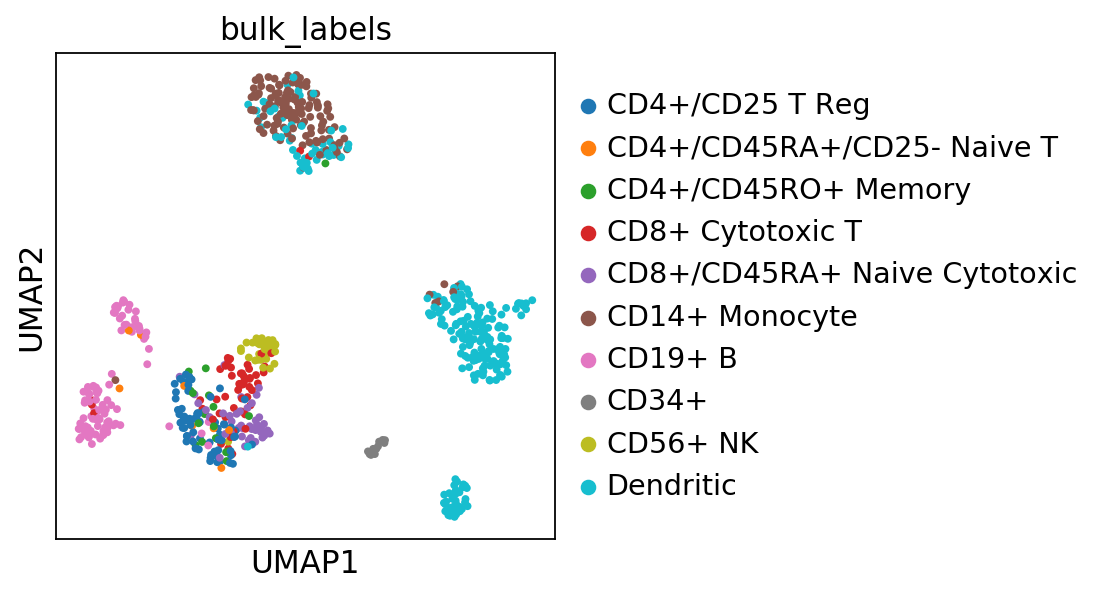
sc.pl.umap(pbmc, color=['bulk_labels'], s=50)
Define list of marker genes from literature.
[7]:
marker_genes = ['CD79A', 'MS4A1', 'CD8A', 'CD8B', 'LYZ',  'LGALS3', 'S100A8', 'GNLY', 'NKG7', 'KLRB1',
                'FCGR3A', 'FCER1A', 'CST3']
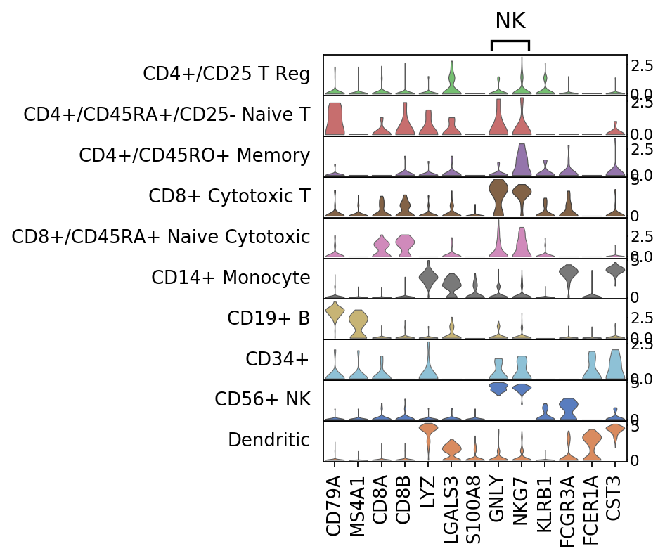
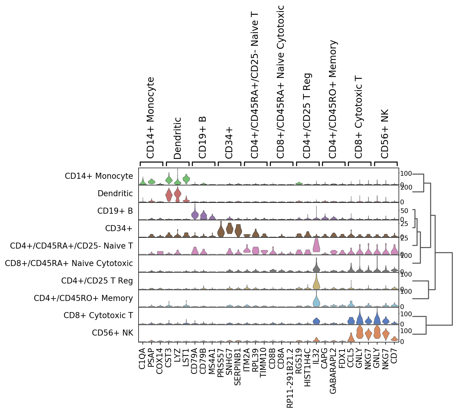
Stacked violins
Plot marker genes per cluster using stacked violin plots.
[8]:
ax = sc.pl.stacked_violin(pbmc, marker_genes, groupby='bulk_labels',
                         var_group_positions=[(7, 8)], var_group_labels=['NK'])
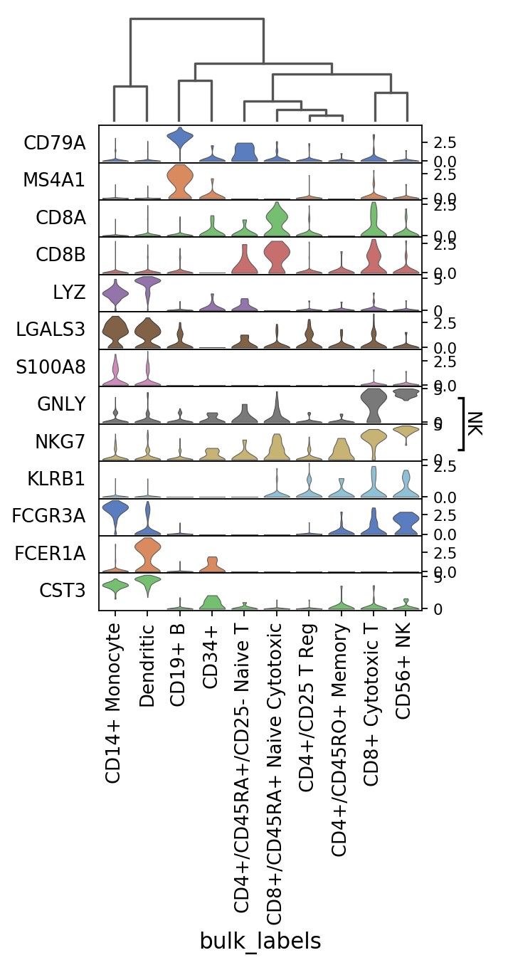
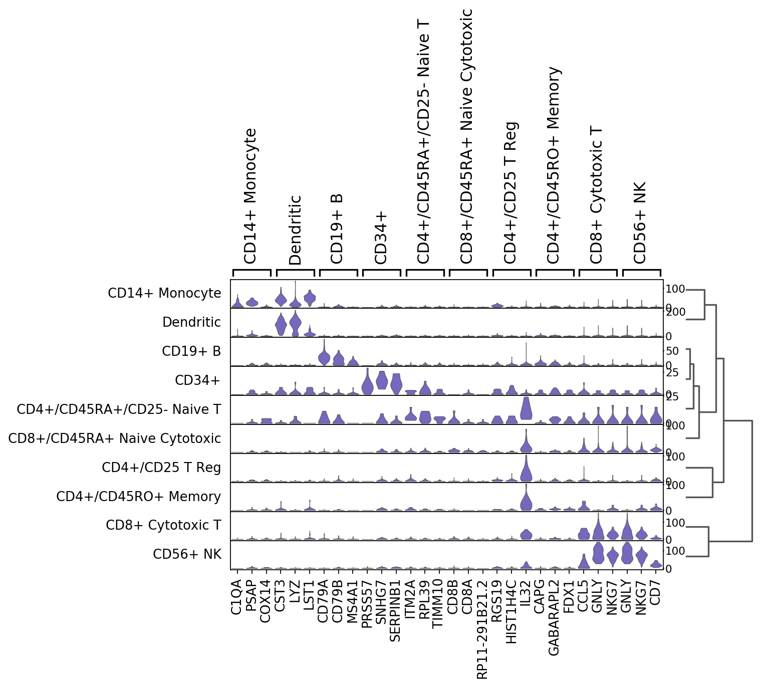
Same as before but swapping the axes and with dendrogram (notice that the categories are reordered).
[9]:
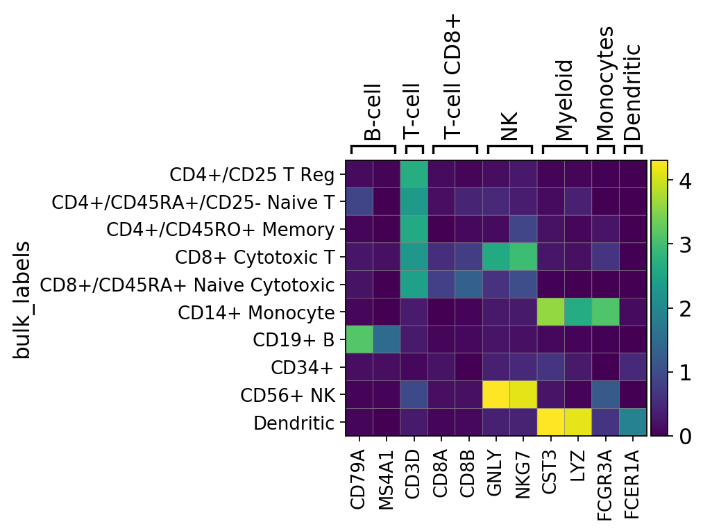
ax = sc.pl.stacked_violin(pbmc, marker_genes, groupby='bulk_labels', swap_axes=True,
                         var_group_positions=[(7, 8)], var_group_labels=['NK'], dendrogram=True)
WARNING: dendrogram data not found (using key=dendrogram_bulk_labels). Running `sc.tl.dendrogram` with default parameters. For fine tuning it is recommended to run `sc.tl.dendrogram` independently.
    using 'X_pca' with n_pcs = 50
Storing dendrogram info using `.uns['dendrogram_bulk_labels']`
WARNING: Groups are not reordered because the `groupby` categories and the `var_group_labels` are different.
categories: CD4+/CD25 T Reg, CD4+/CD45RA+/CD25- Naive T, CD4+/CD45RO+ Memory, etc.
var_group_labels: NK
Dot plots
The dotplot visualization provides a compact way of showing per group, the fraction of cells expressing a gene (dot size) and the mean expression of the gene in those cell (color scale).
The use of the dotplot is only meaningful when the counts matrix contains zeros representing no gene counts. dotplot visualization does not work for scaled or corrected matrices in which cero counts had been replaced by other values.
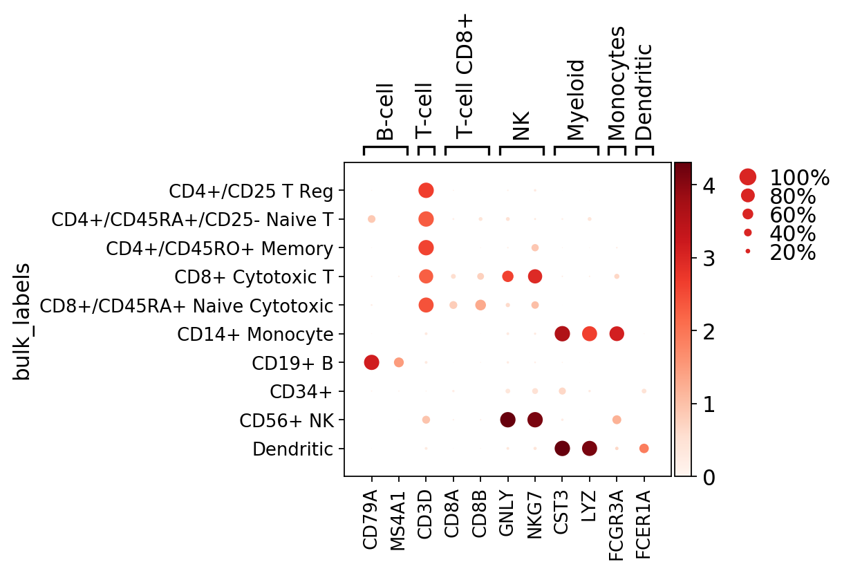
The marker genes list can be a list or a dictionary. If marker genes List is a dictionary, then plot shows the marker genes grouped and labelled
[10]:
marker_genes_dict = {'B-cell': ['CD79A', 'MS4A1'],
                     'T-cell': 'CD3D',
                     'T-cell CD8+': ['CD8A', 'CD8B'],
                     'NK': ['GNLY', 'NKG7'],
                     'Myeloid': ['CST3', 'LYZ'],
                     'Monocytes': ['FCGR3A'],
                     'Dendritic': ['FCER1A']}
[11]:
# use marker genes as dict to group them
ax = sc.pl.dotplot(pbmc, marker_genes_dict, groupby='bulk_labels')
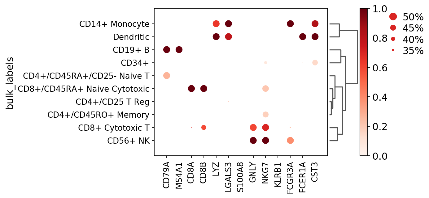
To show some of the options of dot plot, here we add:
- dendrogram=True show dendrogram and reorder group by categories based on dendrogram order
- dot_max=0.5 plot largest dot as 50% or more cells expressing the gene
- dot_min=0.3 plot smallest dot as 30% or less cells expressing the gene
- standard_scale=’var’ normalize the mean gene expression values between 0 and 1
[12]:
ax = sc.pl.dotplot(pbmc, marker_genes, groupby='bulk_labels', dendrogram=True, dot_max=0.5, dot_min=0.3, standard_scale='var')
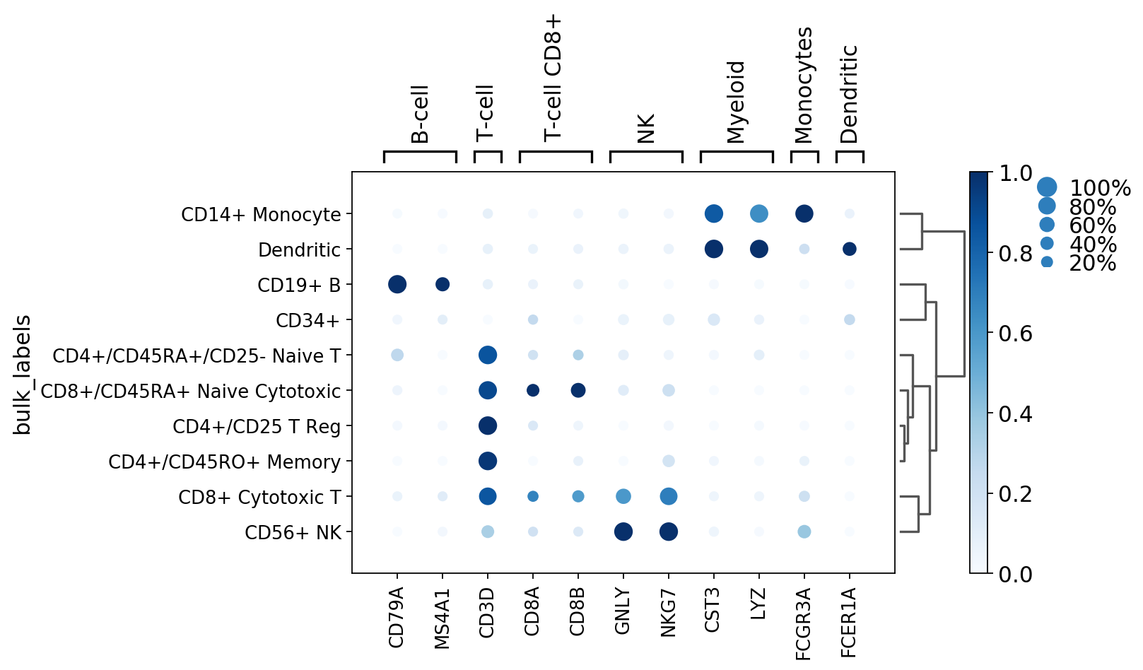
In the next plot we added:
- smallest_dot=40 To increase the size of the smallest dot
- color_map=’Blues’ To change the colormap palette
- figsize=(8,5) To change the default figure size
[13]:
ax = sc.pl.dotplot(pbmc, marker_genes_dict, groupby='bulk_labels', dendrogram=True,
                   standard_scale='var', smallest_dot=40, color_map='Blues', figsize=(8,5))
WARNING: Groups are not reordered because the `groupby` categories and the `var_group_labels` are different.
categories: CD4+/CD25 T Reg, CD4+/CD45RA+/CD25- Naive T, CD4+/CD45RO+ Memory, etc.
var_group_labels: B-cell, T-cell, T-cell CD8+, etc.
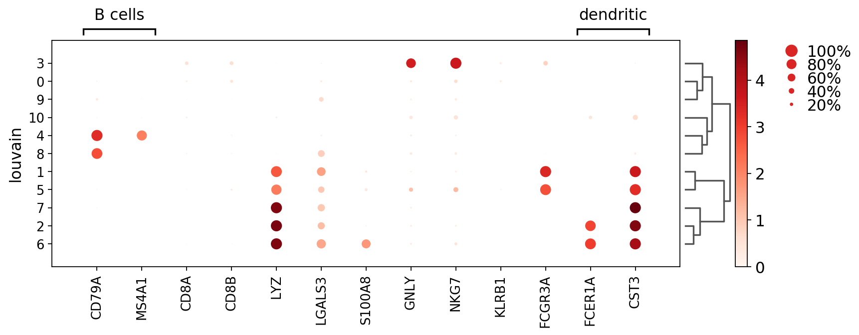
Here we add grouping labels for genes using var_group_positions and var_group_labels
[14]:
ax = sc.pl.dotplot(pbmc, marker_genes, groupby='louvain',
              var_group_positions=[(0,1), (11, 12)],
              var_group_labels=['B cells', 'dendritic'],
              figsize=(12,4), var_group_rotation=0, dendrogram='dendrogram_louvain')
WARNING: dendrogram data not found (using key=dendrogram_louvain). Running `sc.tl.dendrogram` with default parameters. For fine tuning it is recommended to run `sc.tl.dendrogram` independently.
    using 'X_pca' with n_pcs = 50
Storing dendrogram info using `.uns['dendrogram_louvain']`
WARNING: Groups are not reordered because the `groupby` categories and the `var_group_labels` are different.
categories: 0, 1, 2, etc.
var_group_labels: B cells, dendritic
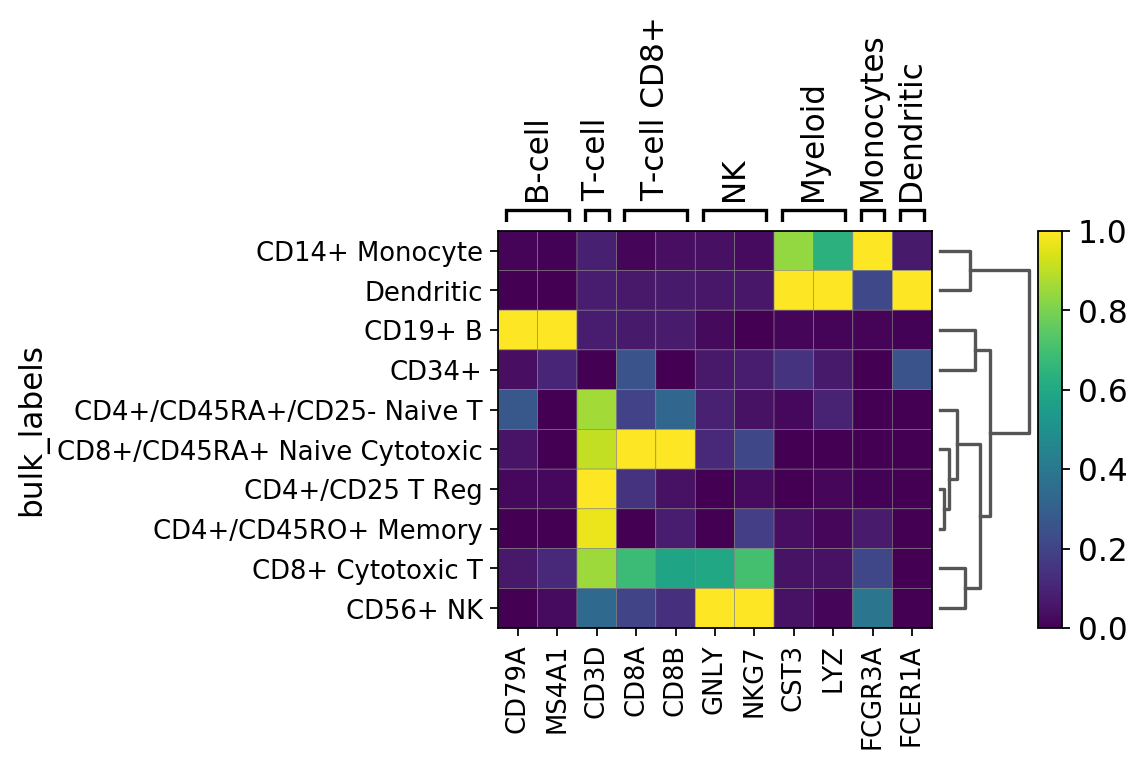
Matrix plots
The matrixplot shows the mean expression of a gene in a group by category as a heatmap. In contrast to dotplot, the matrix plot can be used with corrected and/or scaled counts. By default raw counts are used.
[15]:
gs = sc.pl.matrixplot(pbmc, marker_genes_dict, groupby='bulk_labels')
Next we add a dendrogram and scale the gene expression values between 0 and 1 using standar_scale=var
[16]:
gs = sc.pl.matrixplot(pbmc, marker_genes_dict, groupby='bulk_labels', dendrogram=True, standard_scale='var')
WARNING: Groups are not reordered because the `groupby` categories and the `var_group_labels` are different.
categories: CD4+/CD25 T Reg, CD4+/CD45RA+/CD25- Naive T, CD4+/CD45RO+ Memory, etc.
var_group_labels: B-cell, T-cell, T-cell CD8+, etc.
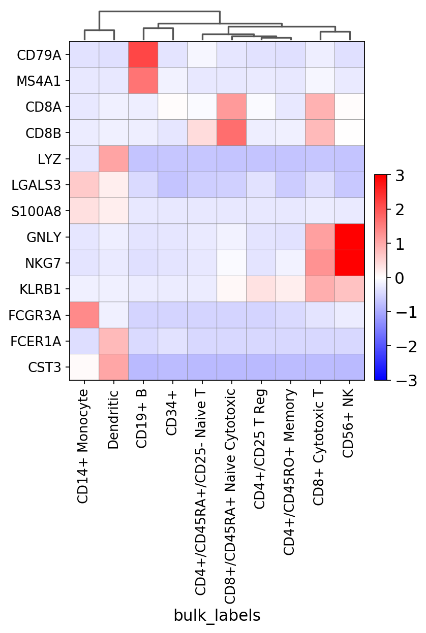
[17]:
# to use the 'non-raw' data we select marker genes present in this data.
marker_genes_2 = [x for x in marker_genes if x in pbmc.var_names]
In the next figure we use: * use_raw=False to use the scaled values (after sc.pp.scale) stored in pbmc.X * vmin=-3, vmax=3, cmap=’bwr’ to select the max and min for the diverging color map ‘bwr’ * swap_axes=True to show genes in rows * figsize=(5,6) to modify the defult figure size
[18]:
gs = sc.pl.matrixplot(pbmc, marker_genes_2, groupby='bulk_labels', dendrogram=True,
                      use_raw=False, vmin=-3, vmax=3, cmap='bwr',  swap_axes=True, figsize=(5,6))
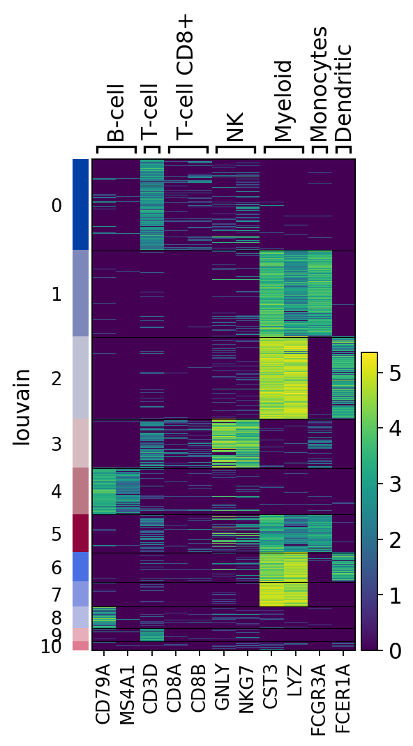
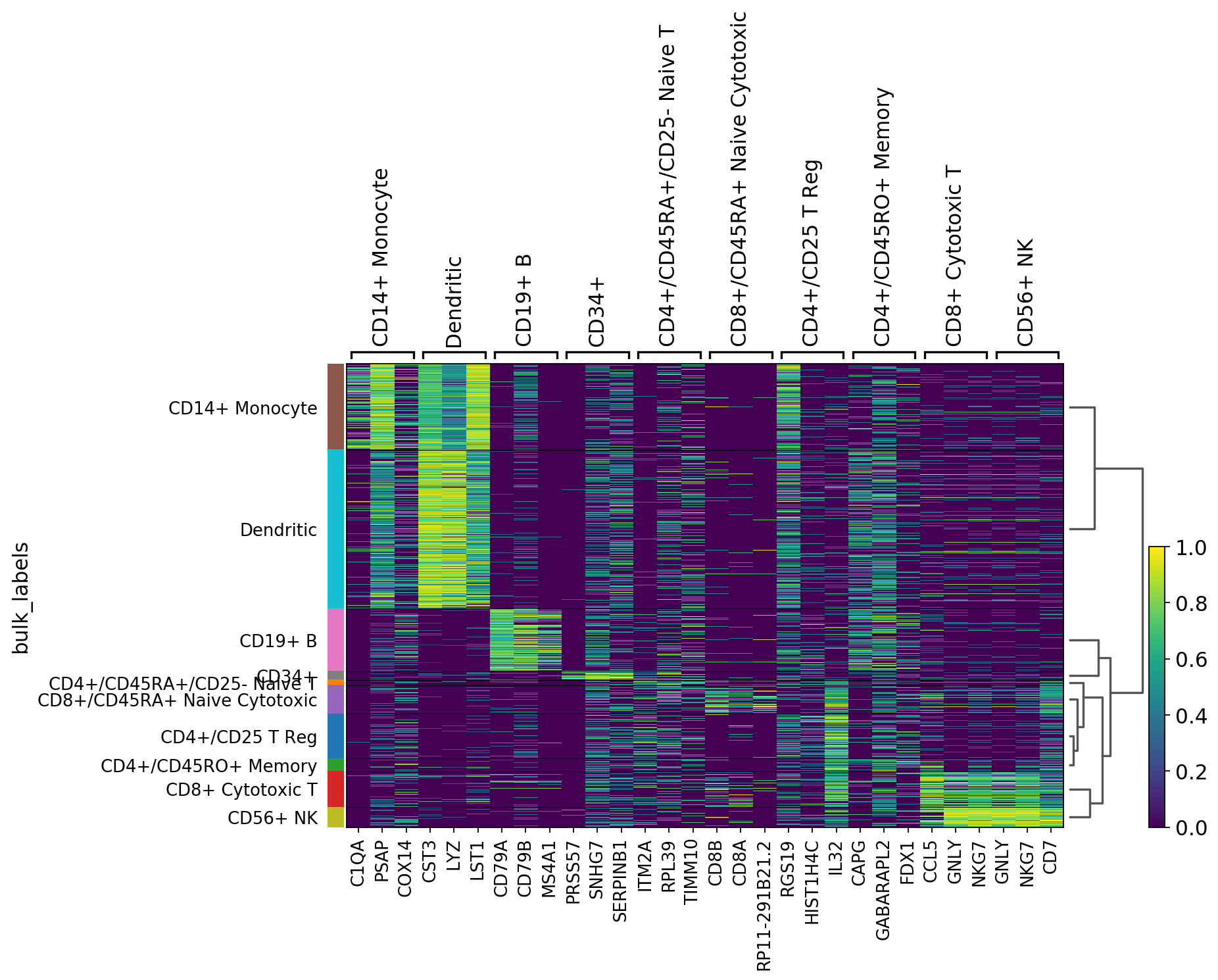
Heatmaps
Heatmaps do not collapse cells as in previous plots. Instead, each cells is shown in a row (or columm if swap_axes=True). The groupby information can be added and is shown using the same color code found for sc.pl.umap or any other scatter plot.
[19]:
ax = sc.pl.heatmap(pbmc,marker_genes_dict, groupby='louvain')
Same as before but using use_raw=False to use the scaled data stored in pbmc.X. Some genes are highlighted using var_groups_positions and var_group_labels and the figure size is adjusted.
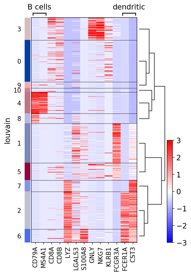
[20]:
ax = sc.pl.heatmap(pbmc, marker_genes, groupby='louvain', figsize=(5, 8),
              var_group_positions=[(0,1), (11, 12)], use_raw=False, vmin=-3, vmax=3, cmap='bwr',
              var_group_labels=['B cells', 'dendritic'], var_group_rotation=0, dendrogram='dendrogram_louvain')
WARNING: Groups are not reordered because the `groupby` categories and the `var_group_labels` are different.
categories: 0, 1, 2, etc.
var_group_labels: B cells, dendritic
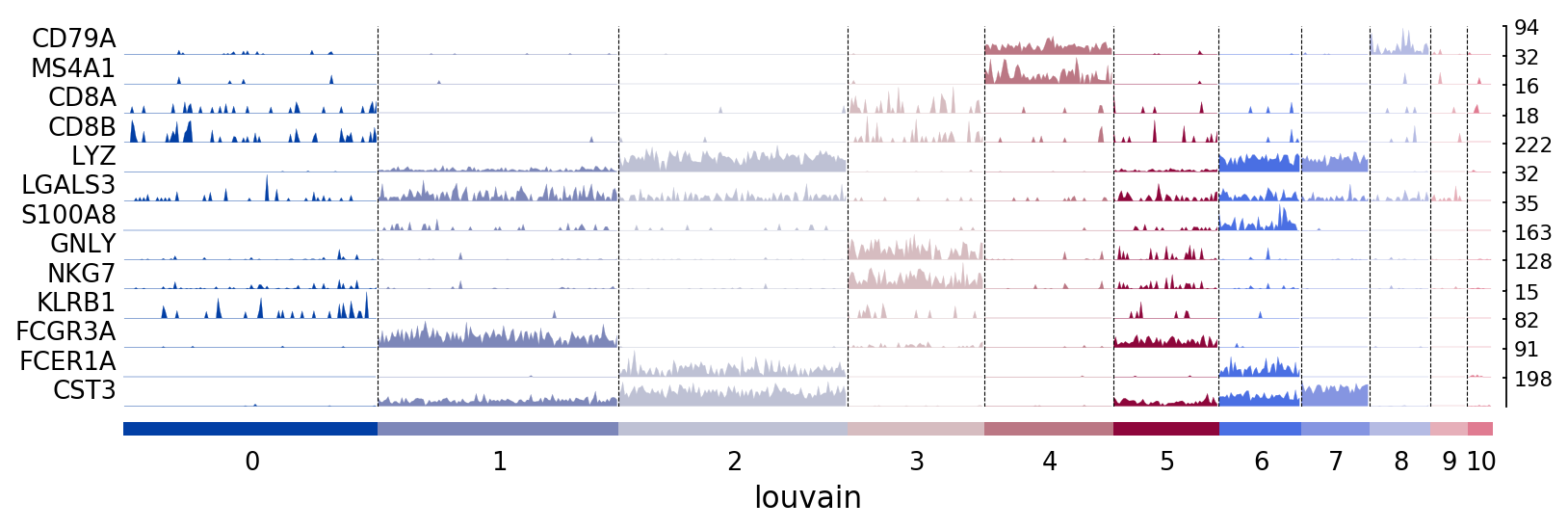
Tracksplots
The track plot shows the same information as the heatmap, but, instead of a color scale, the gene expression is represented by height.
[21]:
# Track plot data is better visualized using the non-log counts
import numpy as np
ad = pbmc.copy()
ad.raw.X.data = np.exp(ad.raw.X.data)
[22]:
ax = sc.pl.tracksplot(ad,marker_genes, groupby='louvain')
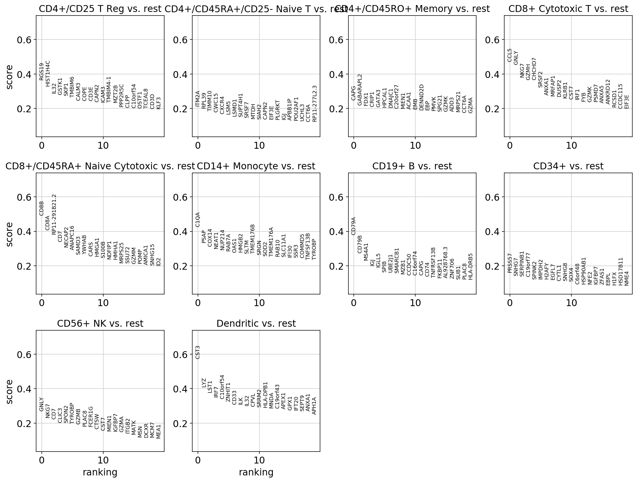
Visualization of marker genes
Gene markers are computed using the bulk_labels categories and the logreg method
[23]:
import warnings
warnings.simplefilter(action='ignore', category=FutureWarning)
sc.tl.rank_genes_groups(pbmc, groupby='bulk_labels', method='logreg')
ranking genes
    finished (0:00:00.21)
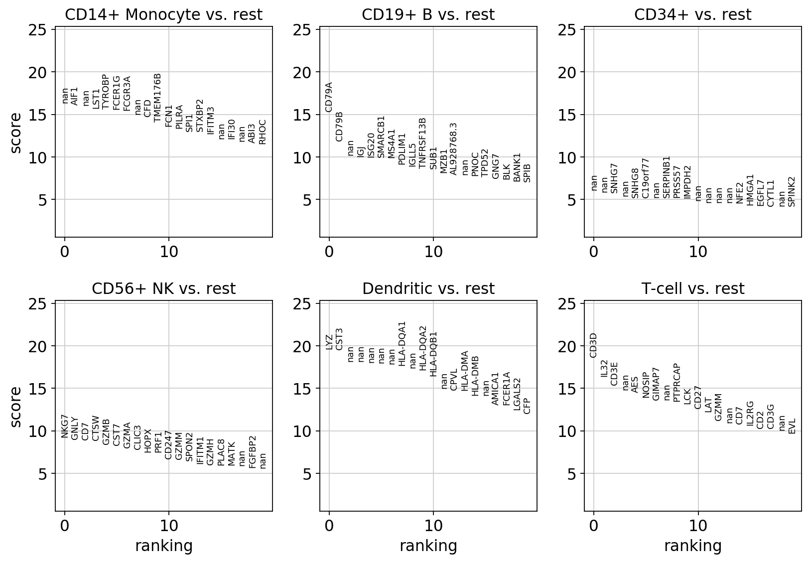
visualize marker genes using panels
[24]:
rcParams['figure.figsize'] = 4,4
rcParams['axes.grid'] = True
sc.pl.rank_genes_groups(pbmc)
Visualize marker genes using dotplot
[25]:
sc.pl.rank_genes_groups_dotplot(pbmc, n_genes=4)
Dotplot focusing only on two groups (the groups option is also available for violin, heatmap and matrix plots).
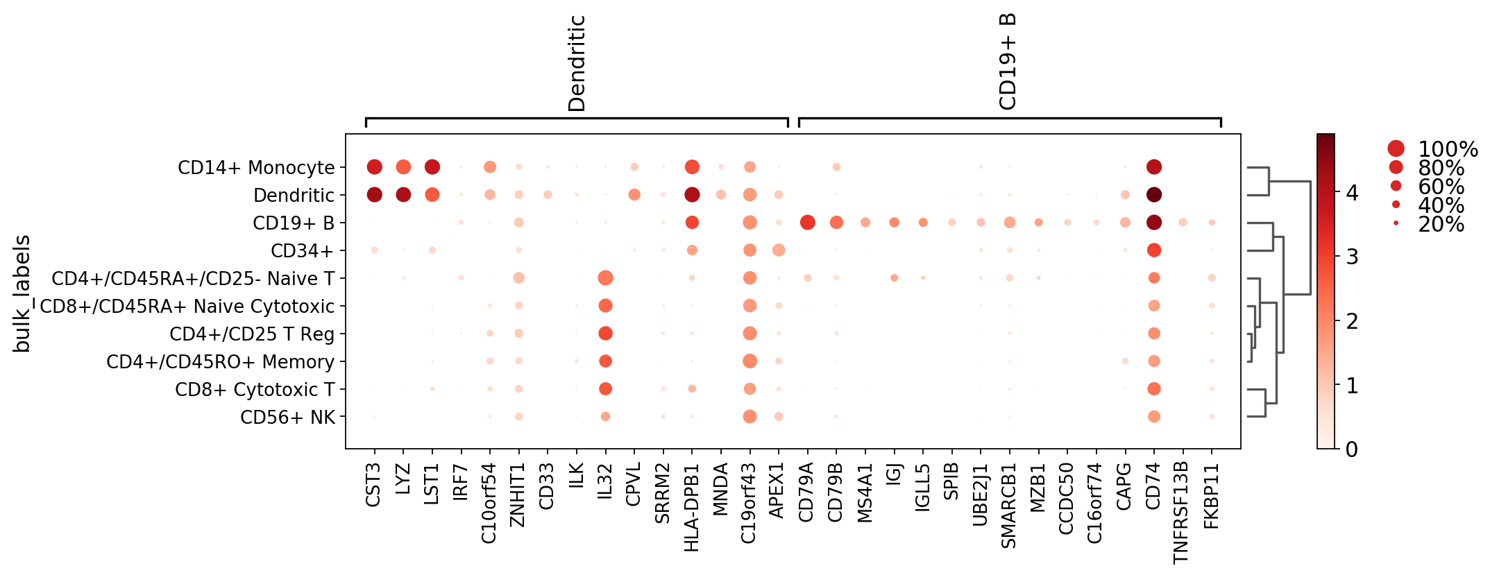
[26]:
axs = sc.pl.rank_genes_groups_dotplot(pbmc, n_genes=15, groups=['Dendritic', 'CD19+ B'])
WARNING: Groups are not reordered because the `groupby` categories and the `var_group_labels` are different.
categories: CD4+/CD25 T Reg, CD4+/CD45RA+/CD25- Naive T, CD4+/CD45RO+ Memory, etc.
var_group_labels: Dendritic, CD19+ B
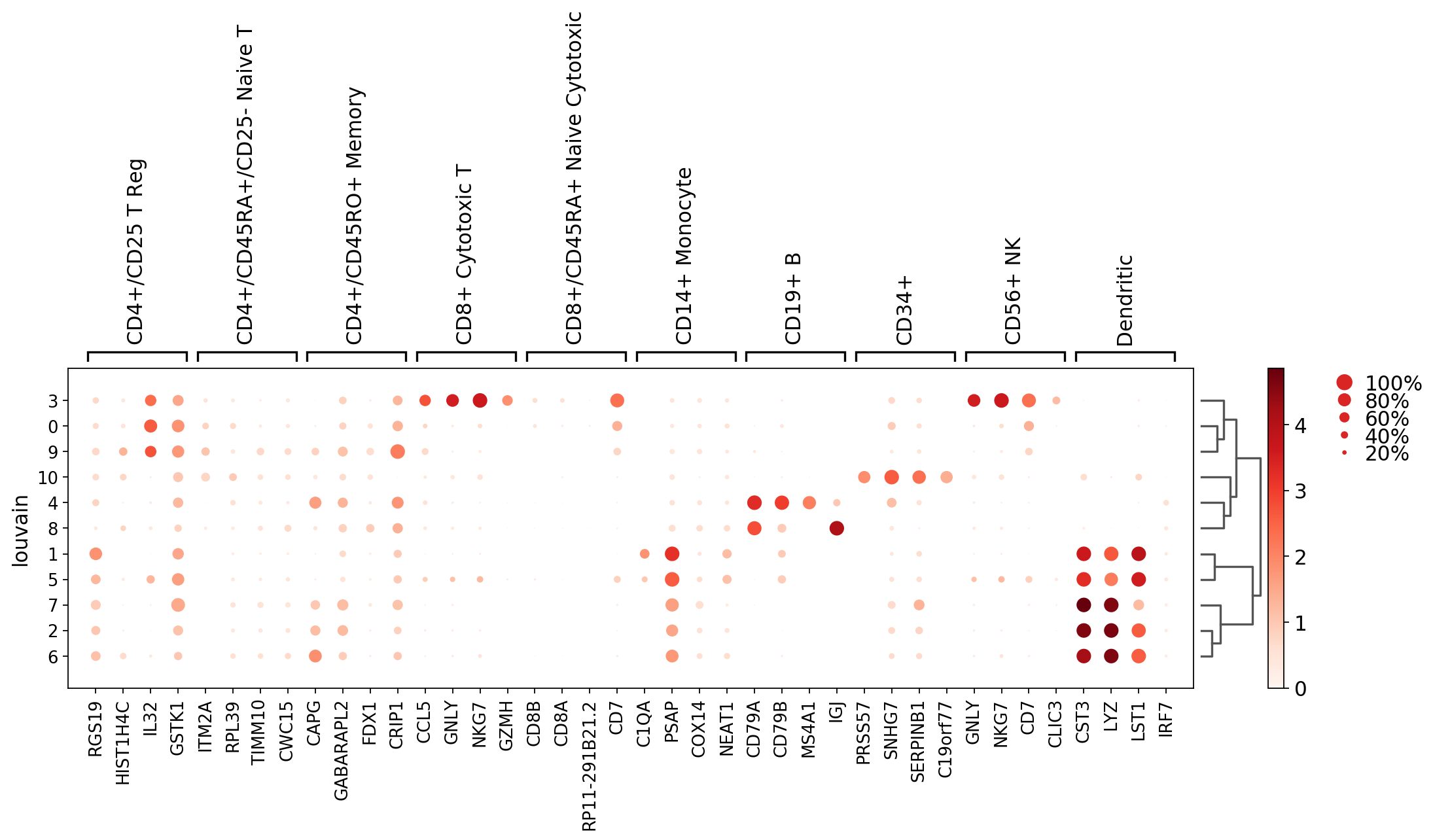
Dotplot showing the marker genes but with respect to ‘louvain’ clusters (in contrast to using the bulk_labels categories as before).
[27]:
axs = sc.pl.rank_genes_groups_dotplot(pbmc, groupby='louvain', n_genes=4, dendrogram='dendrogram_louvain')
WARNING: Groups are not reordered because the `groupby` categories and the `var_group_labels` are different.
categories: 0, 1, 2, etc.
var_group_labels: CD4+/CD25 T Reg, CD4+/CD45RA+/CD25- Naive T, CD4+/CD45RO+ Memory, etc.
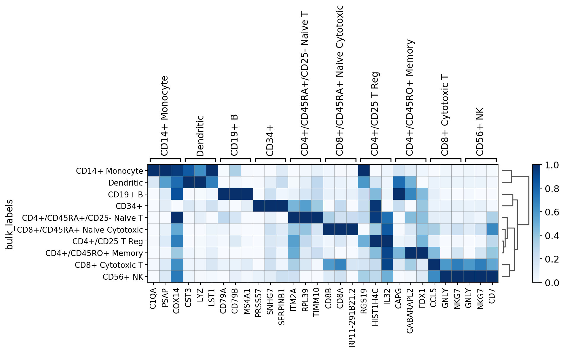
Visualize marker genes using matrixplot
For the following plot the raw gene expression is scaled and the color map is changed from the default to ‘Blues’
[28]:
axs = sc.pl.rank_genes_groups_matrixplot(pbmc, n_genes=3, standard_scale='var', cmap='Blues')
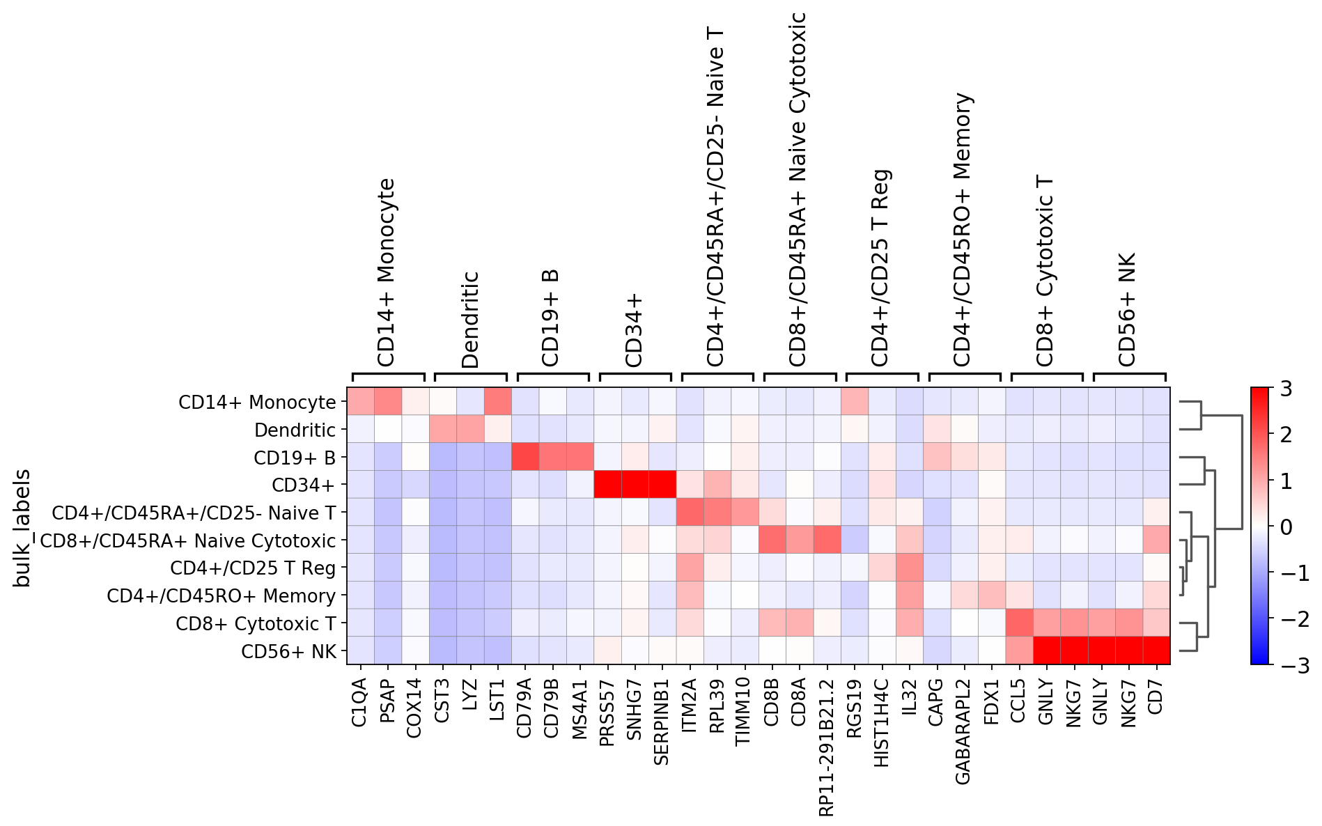
Same as before but using the scaled data and setting a divergent color map
[29]:
axs = sc.pl.rank_genes_groups_matrixplot(pbmc, n_genes=3, use_raw=False, vmin=-3, vmax=3, cmap='bwr')
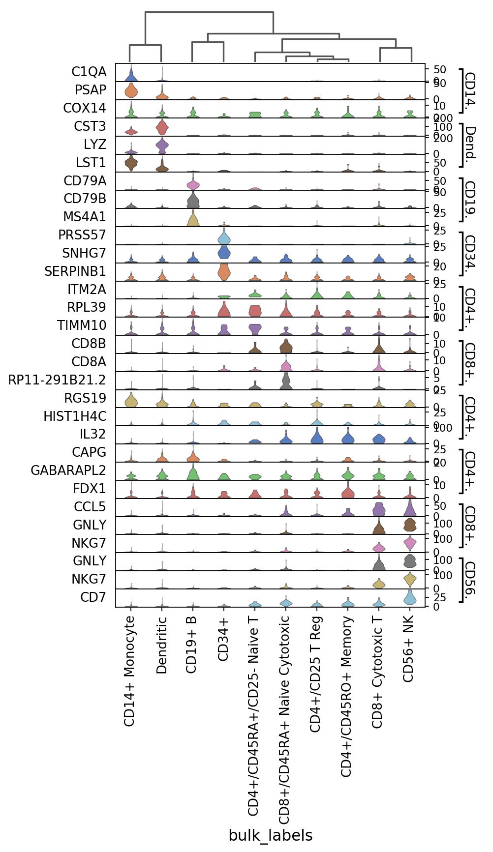
Visualize marker genes using stacked violing plots
[30]:
# instead of pbmc we use the 'ad' object (created earlier) in which the raw matrix is exp(pbmc.raw.matrix). This
# highlights better the differences between the markers.
sc.pl.rank_genes_groups_stacked_violin(ad, n_genes=3)
[31]:
# setting row_palette='slateblue' makes all violin plots of the same color
sc.pl.rank_genes_groups_stacked_violin(ad, n_genes=3, row_palette='slateblue')
Same as previous but with axes swapped.
[32]:
# width is used to set the violin plot width. Here, after setting figsize wider than default,
# the `width` arguments helps to keep the violin plots thin.
sc.pl.rank_genes_groups_stacked_violin(ad, n_genes=3, swap_axes=True, figsize=(6, 10), width=0.4)
Visualize marker genes using heatmap
[33]:
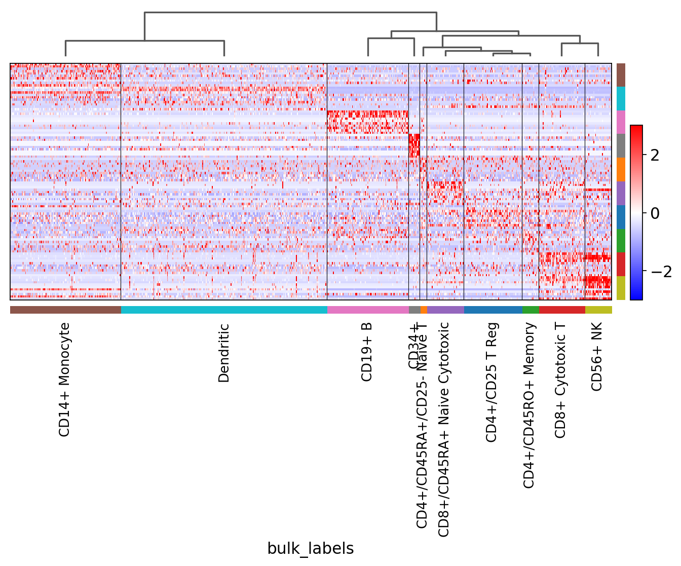
sc.pl.rank_genes_groups_heatmap(pbmc, n_genes=3, standard_scale='var')
[34]:
sc.pl.rank_genes_groups_heatmap(pbmc, n_genes=3, use_raw=False, swap_axes=True, vmin=-3, vmax=3, cmap='bwr')
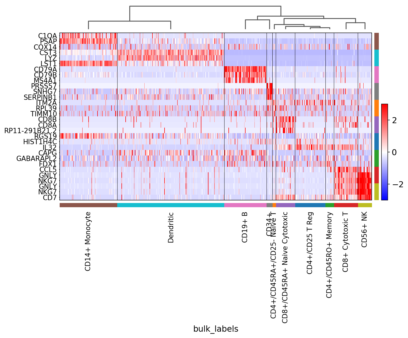
Showing 10 genes per category, turning the gene labels off and swapping the axes. Notice that when the image is swaped, a color code for the categories appear instead of the ‘brackets’.
[35]:
sc.pl.rank_genes_groups_heatmap(pbmc, n_genes=10, use_raw=False, swap_axes=True, show_gene_labels=False,
                                vmin=-3, vmax=3, cmap='bwr')
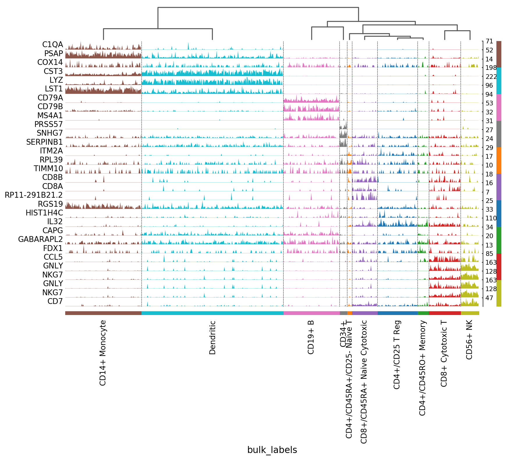
Visualize marker genes using tracksplot
[36]:
sc.pl.rank_genes_groups_tracksplot(ad, n_genes=3)
[37]:
## Filtering of marker genes
The tools sc.tl.filter_rank_genes_groups can be used to select markers that fulfill certain criteria, for example whose fold change is at least 2 with respect to other categories and that are expresssed on 50% of the category cells.
[38]:
# define a new category called 'broad_type' which collapses all T-cells into one group
t_cell = ['CD4+/CD25 T Reg', 'CD4+/CD45RA+/CD25- Naive T', 'CD4+/CD45RO+ Memory','CD8+ Cytotoxic T', 'CD8+/CD45RA+ Naive Cytotoxic']
pbmc.obs['broad_type'] = pd.Categorical(pbmc.obs.bulk_labels.apply(lambda x: x if x not in t_cell  else 'T-cell'))
[39]:
# find gene markers in the 'broad_type' group.
sc.tl.rank_genes_groups(pbmc, 'broad_type', method='wilcoxon', n_genes=200)
ranking genes
    finished (0:00:00.06)
[40]:
sc.tl.filter_rank_genes_groups(pbmc)
Filtering genes using: min_in_group_fraction: 0.25 min_fold_change: 2, max_out_group_fraction: 0.5
[41]:
rcParams['figure.figsize'] = 4,4
rcParams['axes.grid'] = True
sc.pl.rank_genes_groups(pbmc, key='rank_genes_groups_filtered', ncols=3)
All filtered genes are set to nan.
[42]:
sc.pl.rank_genes_groups_heatmap(pbmc, n_genes=200, key='rank_genes_groups_filtered',
                                swap_axes=True, use_raw=False, vmax=3, vmin=-3, cmap='bwr', dendrogram=True)
WARNING: dendrogram data not found (using key=dendrogram_broad_type). Running `sc.tl.dendrogram` with default parameters. For fine tuning it is recommended to run `sc.tl.dendrogram` independently.
    using 'X_pca' with n_pcs = 50
Storing dendrogram info using `.uns['dendrogram_broad_type']`
WARNING: Gene labels are not shown when more than 50 genes are visualized. To show gene labels set `show_gene_labels=True`
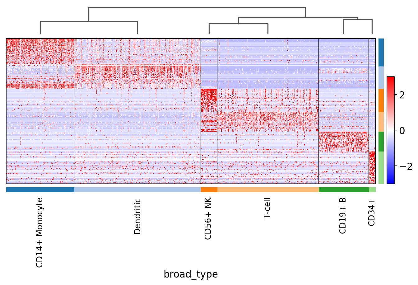
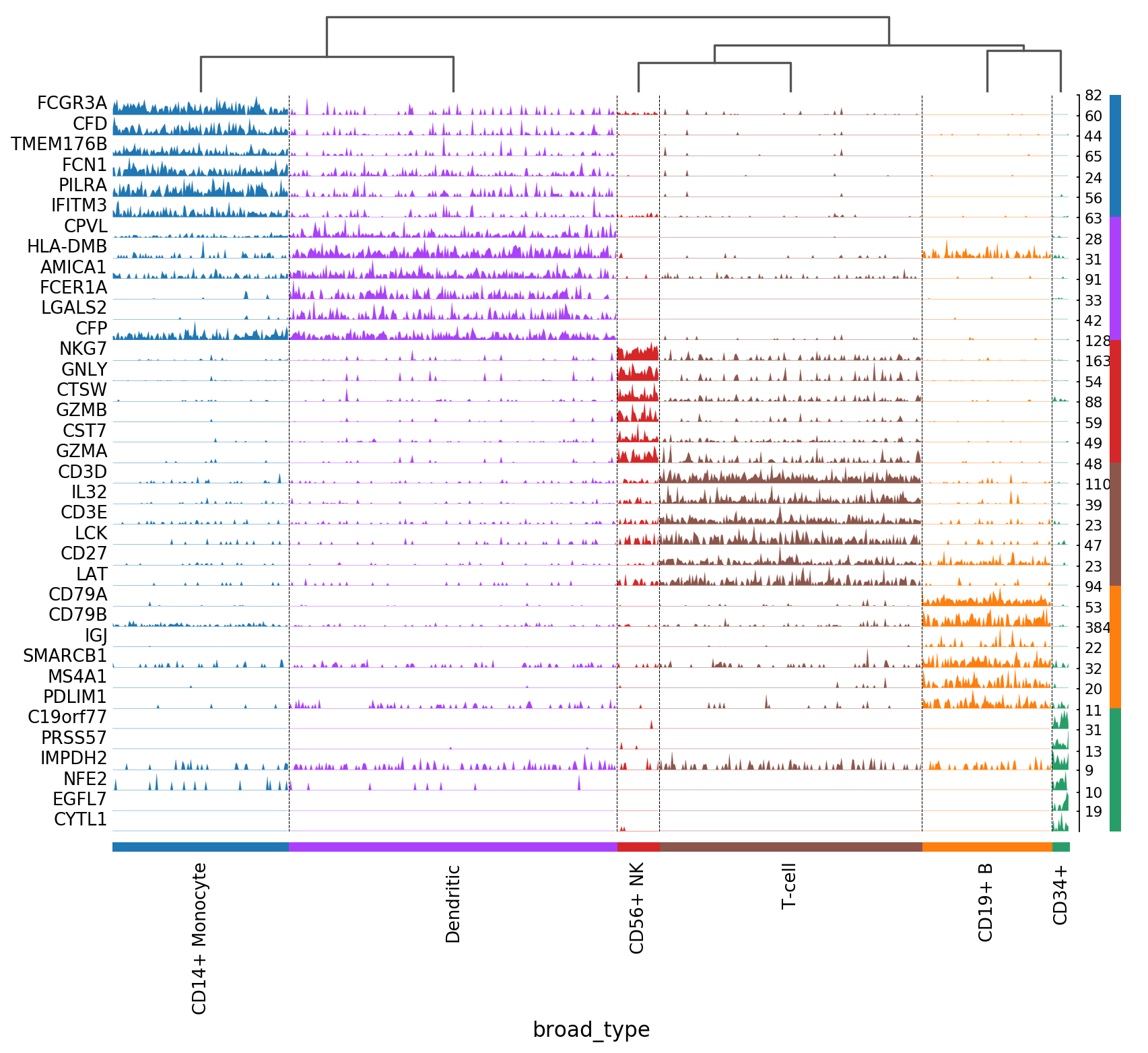
Notice that n_genes=200 is set, but only the maximum number of filtered genes found is actually plotted. For example, for CD34+ only few genes are shown.
Apply more stringent marker gene filters.
[43]:
sc.tl.filter_rank_genes_groups(pbmc,
                               min_in_group_fraction=0.5,
                               max_out_group_fraction=0.3,
                               min_fold_change=1.5)
Filtering genes using: min_in_group_fraction: 0.5 min_fold_change: 1.5, max_out_group_fraction: 0.3
Without filtering.
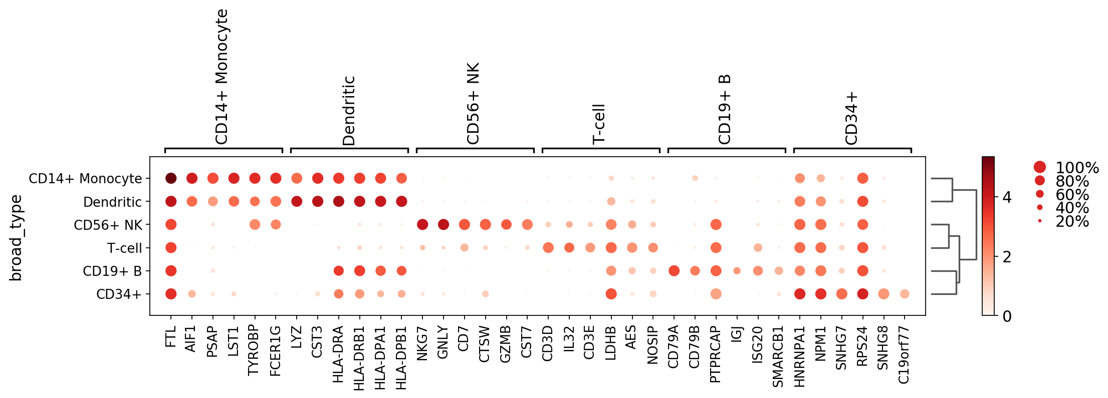
[44]:
sc.pl.rank_genes_groups_dotplot(pbmc, n_genes=6)
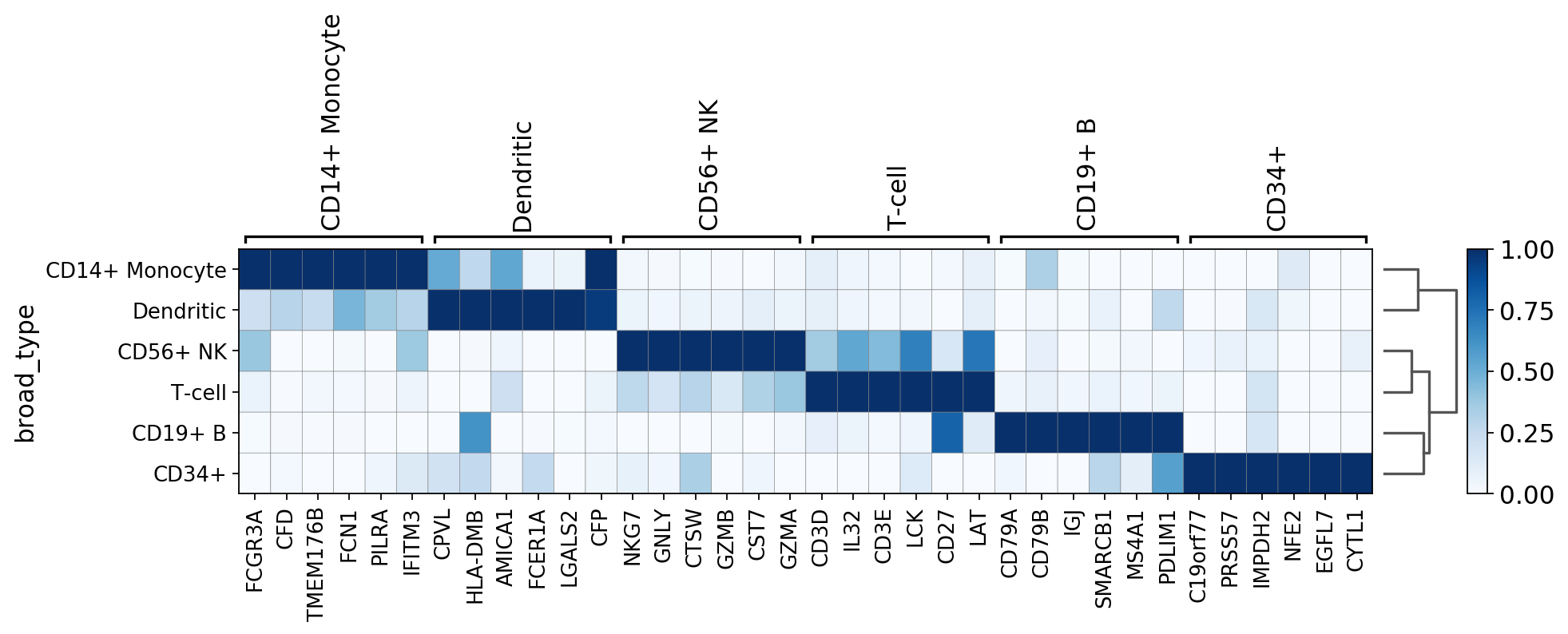
With filtering.
[45]:
sc.pl.rank_genes_groups_dotplot(pbmc, n_genes=6, key='rank_genes_groups_filtered')

[46]:
sc.pl.rank_genes_groups_matrixplot(pbmc, n_genes=6, key='rank_genes_groups_filtered', standard_scale='var', cmap='Blues')
[47]:
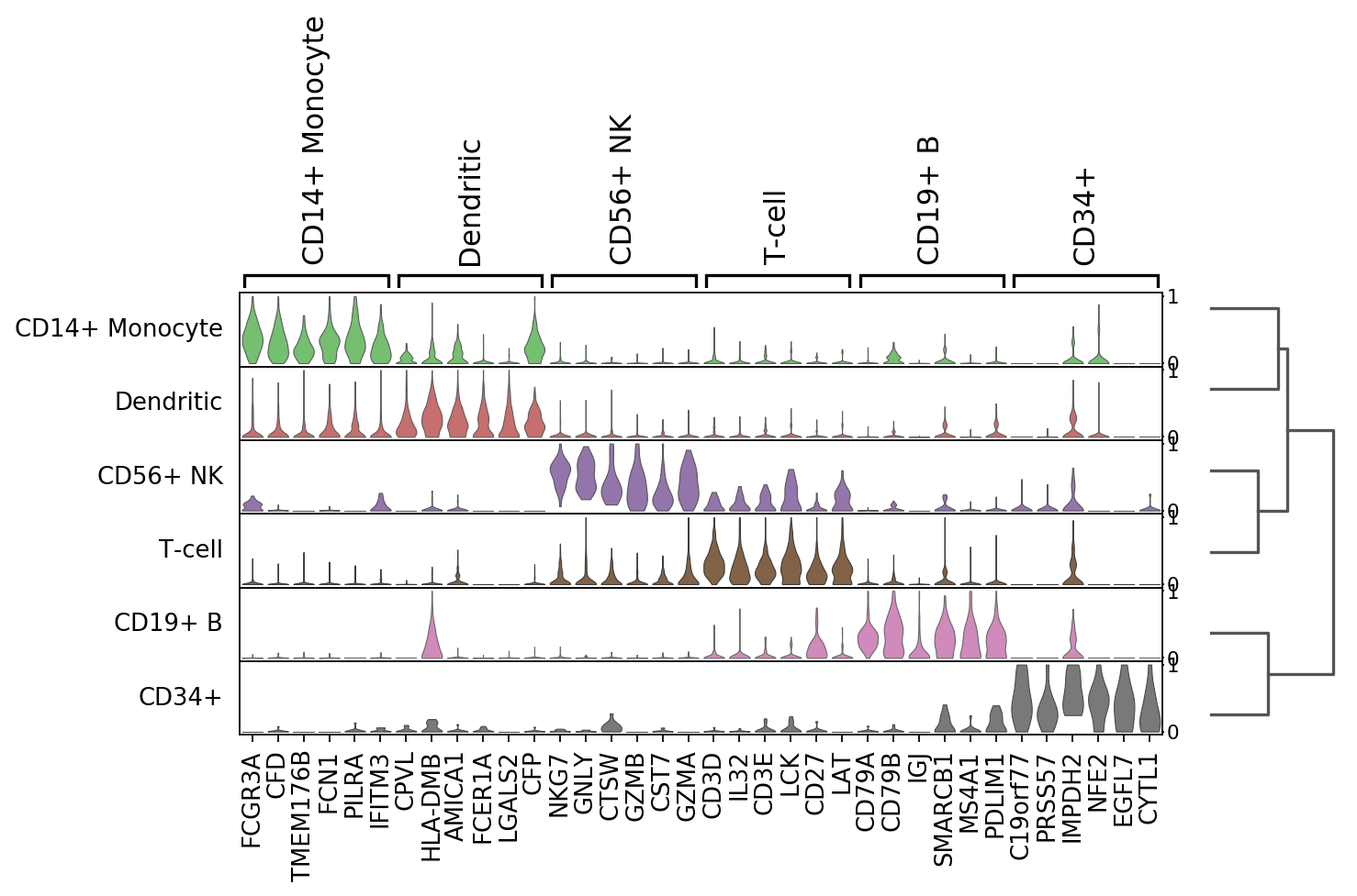
# Track plot data and violin is better visualized using the non-log counts
ad = pbmc.copy()
ad.raw.X.data = np.exp(ad.raw.X.data)
[48]:
sc.pl.rank_genes_groups_stacked_violin(ad, n_genes=6, key='rank_genes_groups_filtered', standard_scale='var')
[49]:
sc.pl.rank_genes_groups_tracksplot(ad, n_genes=6, key='rank_genes_groups_filtered')
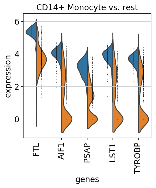
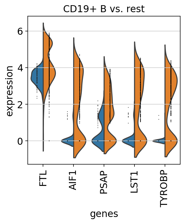
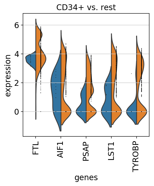
Compare CD4+/CD25 T Reg markers vs. rest using violin
[50]:
pbmc.obs.bulk_labels.cat.categories[0]
[50]:
'CD4+/CD25 T Reg'
[51]:
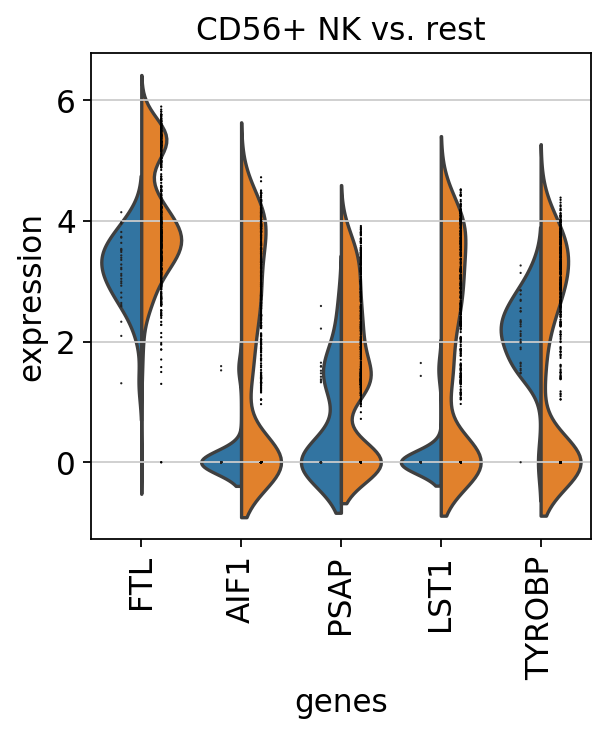
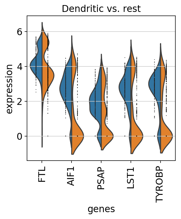
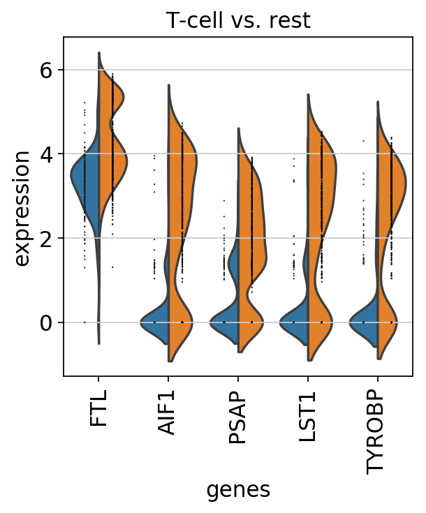
sc.pl.rank_genes_groups_violin(pbmc, n_genes=5, jitter=False)
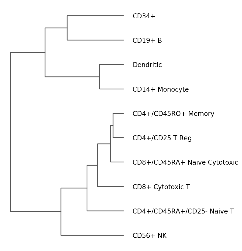
Dendrogram options
Hierarchical clusterings for categorical observations can also be visualized independently using sc.pl.dendrogram
[52]:
ax = sc.pl.dendrogram(pbmc, 'bulk_labels')
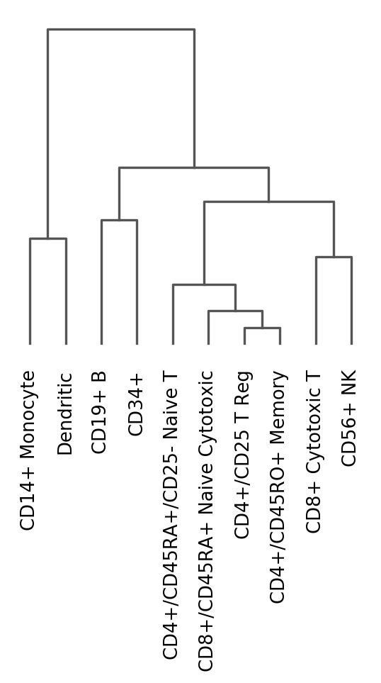
The previous image uses a dendrogram that was already computed.
We can re-run the dendrogram function to use other parameters
[53]:
# compute hiearchical clustering based on the
# given `var_names` from the raw matrix
sc.tl.dendrogram(pbmc, 'bulk_labels', var_names=marker_genes, use_raw=True)
Storing dendrogram info using `.uns['dendrogram_bulk_labels']`
[54]:
rcParams['figure.figsize'] = 4,8
ax = sc.pl.dendrogram(pbmc, 'bulk_labels', orientation='left')
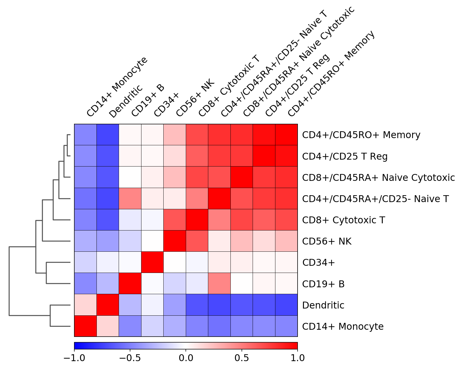
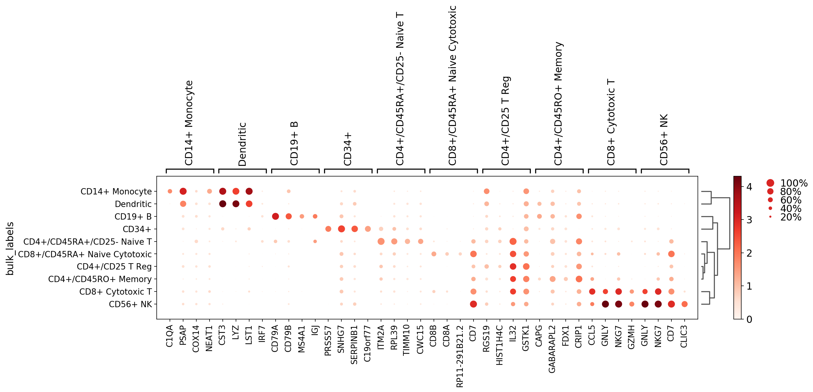
Plot correlation
Together with the dendrogram it is possible to plot the correlation (by default ‘pearson’) of the categories.
[55]:
# compute hiearchical clustering based on the
# given `var_names` from the raw matrix
sc.tl.dendrogram(pbmc, 'bulk_labels', n_pcs=30)
    using 'X_pca' with n_pcs = 30
Storing dendrogram info using `.uns['dendrogram_bulk_labels']`
[56]:
ax = sc.pl.correlation_matrix(pbmc, 'bulk_labels')
(0.0, 10.0)