Danger
Please access this document in its canonical location as the currently accessed page may not be rendered correctly: Trajectory inference for hematopoiesis in mouse
Trajectory inference for hematopoiesis in mouse#
See also
More examples for trajectory inference on complex datasets can be found in the PAGA repository [Wolf2019], for instance, multi-resolution analyses of whole animals, such as for planaria for data of [Plass2018].

Reconstructing myeloid and erythroid differentiation for data of [Paul2015].
from __future__ import annotations

import matplotlib.pyplot as plt
import numpy as np
import scanpy as sc
sc.settings.verbosity = 3  # verbosity: errors (0), warnings (1), info (2), hints (3)
sc.logging.print_versions()
results_file = "./write/paul15.h5ad"
# low dpi (dots per inch) yields small inline figures
sc.settings.set_figure_params(dpi=80, frameon=False, figsize=(3, 3), facecolor="white")
-----
anndata     0.10.9
scanpy      1.10.3
-----
PIL                 10.4.0
asttokens           NA
charset_normalizer  3.3.2
comm                0.2.2
cycler              0.12.1
cython_runtime      NA
dateutil            2.9.0.post0
debugpy             1.8.5
decorator           5.1.1
executing           2.1.0
h5py                3.11.0
igraph              0.11.6
ipykernel           6.29.5
jaraco              NA
jedi                0.19.1
joblib              1.4.2
kiwisolver          1.4.7
legacy_api_wrap     NA
leidenalg           0.10.2
llvmlite            0.43.0
louvain             0.8.2
matplotlib          3.9.2
more_itertools      10.5.0
mpl_toolkits        NA
natsort             8.4.0
numba               0.60.0
numpy               2.0.2
packaging           24.1
pandas              2.2.3
parso               0.8.4
pkg_resources       NA
platformdirs        4.3.3
prompt_toolkit      3.0.47
psutil              6.0.0
pure_eval           0.2.3
pydev_ipython       NA
pydevconsole        NA
pydevd              2.9.5
pydevd_file_utils   NA
pydevd_plugins      NA
pydevd_tracing      NA
pygments            2.18.0
pyparsing           3.1.4
pytz                2024.2
scipy               1.14.1
session_info        1.0.0
six                 1.16.0
sklearn             1.5.2
stack_data          0.6.3
texttable           1.7.0
threadpoolctl       3.5.0
tornado             6.4.1
traitlets           5.14.3
vscode              NA
wcwidth             0.2.13
zmq                 26.2.0
-----
IPython             8.27.0
jupyter_client      8.6.2
jupyter_core        5.7.2
-----
Python 3.12.6 (main, Sep  8 2024, 13:18:56) [GCC 14.2.1 20240805]
Linux-6.10.10-zen1-1-zen-x86_64-with-glibc2.40
-----
Session information updated at 2024-09-24 14:08
adata = sc.datasets.paul15()
adata
AnnData object with n_obs × n_vars = 2730 × 3451
    obs: 'paul15_clusters'
    uns: 'iroot'
Let us work with a higher precision than the default ‘float32’ to ensure exactly the same results across different computational platforms.
# this is not required and results will be comparable without it
adata.X = adata.X.astype("float64")
Preprocessing and Visualization#
Apply a simple preprocessing recipe: scanpy.pp.recipe_zheng17().
sc.pp.recipe_zheng17(adata)
running recipe zheng17
normalizing counts per cell
    finished (0:00:00)
extracting highly variable genes
    finished (0:00:00)
normalizing counts per cell
    finished (0:00:00)
    finished (0:00:00)
sc.tl.pca(adata, svd_solver="arpack")
computing PCA
    with n_comps=50
    finished (0:00:02)
sc.pp.neighbors(adata, n_neighbors=4, n_pcs=20)
sc.tl.draw_graph(adata)
computing neighbors
    using 'X_pca' with n_pcs = 20
    finished: added to `.uns['neighbors']`
    `.obsp['distances']`, distances for each pair of neighbors
    `.obsp['connectivities']`, weighted adjacency matrix (0:00:04)
drawing single-cell graph using layout 'fa'
    finished: added
    'X_draw_graph_fa', graph_drawing coordinates (adata.obsm) (0:00:10)
sc.pl.draw_graph(adata, color="paul15_clusters", legend_loc="on data")
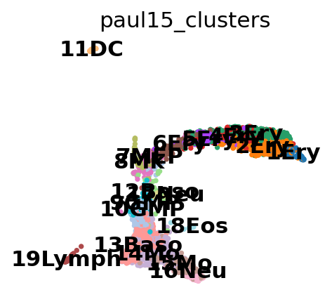
This looks pretty messy.
Optional: Denoising the graph#
To denoise the graph, we represent it in diffusion map space (and not in PCA space). Computing distances within a few diffusion components amounts to denoising the graph – we just take a few of the first spectral components. It’s very similar to denoising a data matrix using PCA. The approach has been used in a couple of papers, see e.g. [Schiebinger2019] or [Tabaka2019]. It’s also related to the principles behind MAGIC [vanDijk2018].
Note
This is not a necessary step, neither for PAGA, nor clustering, nor pseudotime estimation. You might just as well go ahead with a non-denoised graph. In many situations (also here), this will give you very decent results.
sc.tl.diffmap(adata)
sc.pp.neighbors(adata, n_neighbors=10, use_rep="X_diffmap")
computing Diffusion Maps using n_comps=15(=n_dcs)
computing transitions
    finished (0:00:00)
    eigenvalues of transition matrix
    [1.         1.         0.9989278  0.99671    0.99430376 0.98939794
     0.9883687  0.98731077 0.98398703 0.983007   0.9790806  0.9762548
     0.9744365  0.9729161  0.9652972 ]
    finished: added
    'X_diffmap', diffmap coordinates (adata.obsm)
    'diffmap_evals', eigenvalues of transition matrix (adata.uns) (0:00:00)
computing neighbors
    finished: added to `.uns['neighbors']`
    `.obsp['distances']`, distances for each pair of neighbors
    `.obsp['connectivities']`, weighted adjacency matrix (0:00:00)
sc.tl.draw_graph(adata)
drawing single-cell graph using layout 'fa'
    finished: added
    'X_draw_graph_fa', graph_drawing coordinates (adata.obsm) (0:00:08)
sc.pl.draw_graph(adata, color="paul15_clusters", legend_loc="on data")
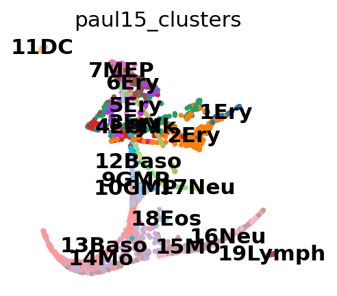
This still looks messy, but in a different way: a lot of the branches are overplotted.
Clustering and PAGA#
Note
Note that today, we’d use sc.tl.leiden - here, we use sc.tl.louvain the sake of reproducing the paper results.
sc.tl.louvain(adata, resolution=1.0)
running Louvain clustering
    using the "louvain" package of Traag (2017)
    finished: found 25 clusters and added
    'louvain', the cluster labels (adata.obs, categorical) (0:00:00)
Annotate the clusters using marker genes.
cell type |
marker |
|---|---|
HSCs |
Procr |
Erythroids |
Gata1, Klf1, Epor, Gypa, Hba-a2, Hba-a1, Spi1 |
Neutrophils |
Elane, Cebpe, Ctsg, Mpo, Gfi1 |
Monocytes |
Irf8, Csf1r, Ctsg, Mpo |
Megakaryocytes |
Itga2b (encodes protein CD41), Pbx1, Sdpr, Vwf |
Basophils |
Mcpt8, Prss34 |
B cells |
Cd19, Vpreb2, Cd79a |
Mast cells |
Cma1, Gzmb, CD117/C-Kit |
Mast cells & Basophils |
Ms4a2, Fcer1a, Cpa3, CD203c (human) |
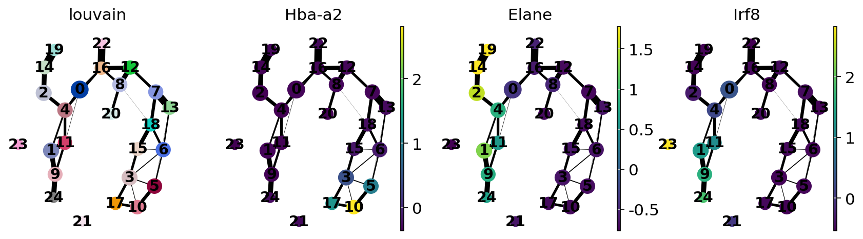
For simple, coarse-grained visualization, compute the PAGA graph, a coarse-grained and simplified (abstracted) graph. Non-significant edges in the coarse- grained graph are thresholded away.
sc.tl.paga(adata, groups="louvain")
running PAGA
    finished: added
    'paga/connectivities', connectivities adjacency (adata.uns)
    'paga/connectivities_tree', connectivities subtree (adata.uns) (0:00:00)
sc.pl.paga(adata, color=["louvain", "Hba-a2", "Elane", "Irf8"])
--> added 'pos', the PAGA positions (adata.uns['paga'])
sc.pl.paga(adata, color=["louvain", "Itga2b", "Prss34", "Cma1"])
--> added 'pos', the PAGA positions (adata.uns['paga'])
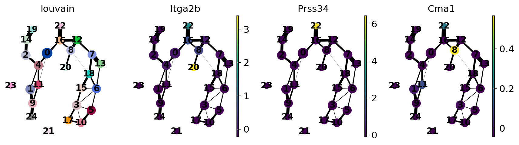
Actually annotate the clusters — note that Cma1 is a Mast cell marker and only appears in a small fraction of the cells in the progenitor/stem cell cluster 8, see the single-cell resolved plot below.
adata.obs["louvain"].cat.categories
Index(['0', '1', '2', '3', '4', '5', '6', '7', '8', '9', '10', '11', '12',
       '13', '14', '15', '16', '17', '18', '19', '20', '21', '22', '23', '24'],
      dtype='object')
adata.obs["louvain_anno"] = adata.obs["louvain"].cat.rename_categories(
    {
        "10": "10/Ery",
        "16": "16/Stem",
        "19": "19/Neu",
        "20": "20/Mk",
        "22": "22/Baso",
        "24": "24/Mo",
    }
)
Let’s use the annotated clusters for PAGA.
sc.tl.paga(adata, groups="louvain_anno")
running PAGA
    finished: added
    'paga/connectivities', connectivities adjacency (adata.uns)
    'paga/connectivities_tree', connectivities subtree (adata.uns) (0:00:00)
sc.pl.paga(adata, threshold=0.03, show=False)
--> added 'pos', the PAGA positions (adata.uns['paga'])
<Axes: >

Recomputing the embedding using PAGA-initialization#
The following is just as well possible for a UMAP.
sc.tl.draw_graph(adata, init_pos="paga")
drawing single-cell graph using layout 'fa'
    finished: added
    'X_draw_graph_fa', graph_drawing coordinates (adata.obsm) (0:00:08)
Now we can see all marker genes also at single-cell resolution in a meaningful layout.
sc.pl.draw_graph(adata, color=["louvain_anno", "Itga2b", "Prss34", "Cma1"], legend_loc="on data")
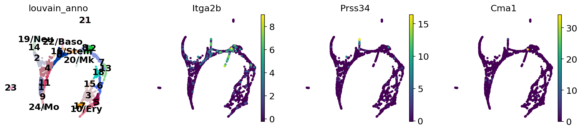
sc.pl.draw_graph(adata, color=["louvain_anno", "Itga2b", "Prss34", "Cma1"], legend_loc="on data")
Choose the colors of the clusters a bit more consistently.
plt.figure(figsize=(8, 2))
for i in range(28):
    plt.scatter(i, 1, c=sc.pl.palettes.zeileis_28[i], s=200)
plt.show()
zeileis_colors = np.array(sc.pl.palettes.zeileis_28)
new_colors = np.array(adata.uns["louvain_anno_colors"])
new_colors[[16]] = zeileis_colors[[12]]  # Stem colors / green
new_colors[[10, 17, 5, 3, 15, 6, 18, 13, 7, 12]] = zeileis_colors[  # Ery colors / red
    [5, 5, 5, 5, 11, 11, 10, 9, 21, 21]
]
new_colors[[20, 8]] = zeileis_colors[[17, 16]]  # Mk early Ery colors / yellow
new_colors[[4, 0]] = zeileis_colors[[2, 8]]  # lymph progenitors / grey
new_colors[[22]] = zeileis_colors[[18]]  # Baso / turquoise
new_colors[[19, 14, 2]] = zeileis_colors[[6, 6, 6]]  # Neu / light blue
new_colors[[24, 9, 1, 11]] = zeileis_colors[[0, 0, 0, 0]]  # Mo / dark blue
new_colors[[21, 23]] = zeileis_colors[[25, 25]]  # outliers / grey
adata.uns["louvain_anno_colors"] = new_colors
And add some white space to some cluster names. The layout shown here differs from the one in the paper, which can be found here. These differences, however, are only cosmetic. We had to change the layout as we moved from a randomized PCA and float32 to float64 precision.
sc.pl.paga_compare(
    adata,
    threshold=0.03,
    title="",
    right_margin=0.2,
    size=10,
    edge_width_scale=0.5,
    legend_fontsize=12,
    fontsize=12,
    frameon=False,
    edges=True,
)
--> added 'pos', the PAGA positions (adata.uns['paga'])
WARNING: saving figure to file figures/paga_compare.pdf
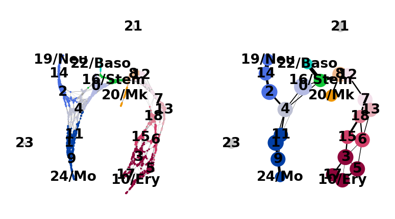
[<Axes: xlabel='FA1', ylabel='FA2'>, <Axes: >]
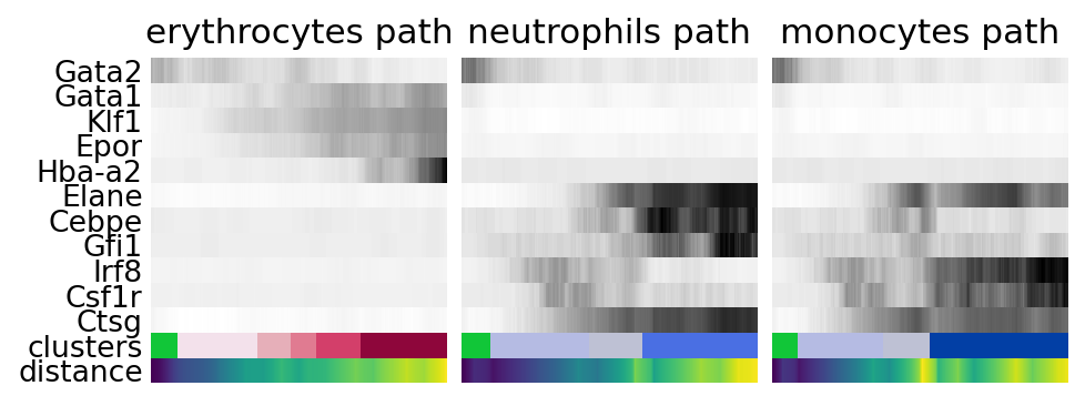
Reconstructing gene changes along PAGA paths for a given set of genes#
Choose a root cell for diffusion pseudotime.
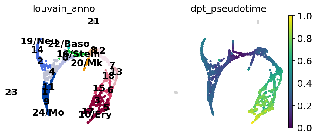
adata.uns["iroot"] = np.flatnonzero(adata.obs["louvain_anno"] == "16/Stem")[0]
sc.tl.dpt(adata)
computing Diffusion Pseudotime using n_dcs=10
    finished: added
    'dpt_pseudotime', the pseudotime (adata.obs) (0:00:00)
Select some of the marker gene names.
gene_names = [
    *["Gata2", "Gata1", "Klf1", "Epor", "Hba-a2"],  # erythroid
    *["Elane", "Cebpe", "Gfi1"],  # neutrophil
    *["Irf8", "Csf1r", "Ctsg"],  # monocyte
]
Use the full raw data for visualization.
adata_raw = sc.datasets.paul15()
sc.pp.log1p(adata_raw)
sc.pp.scale(adata_raw)
adata.raw = adata_raw
sc.pl.draw_graph(adata, color=["louvain_anno", "dpt_pseudotime"], legend_loc="on data")
paths = [
    ("erythrocytes", [16, 12, 7, 13, 18, 6, 5, 10]),
    ("neutrophils", [16, 0, 4, 2, 14, 19]),
    ("monocytes", [16, 0, 4, 11, 1, 9, 24]),
]
adata.obs["distance"] = adata.obs["dpt_pseudotime"]
adata.obs["clusters"] = adata.obs["louvain_anno"] # just a cosmetic change
adata.uns["clusters_colors"] = adata.uns["louvain_anno_colors"]
!mkdir write
_, axs = plt.subplots(ncols=3, figsize=(6, 2.5), gridspec_kw={"wspace": 0.05, "left": 0.12})
plt.subplots_adjust(left=0.05, right=0.98, top=0.82, bottom=0.2)
for ipath, (descr, path) in enumerate(paths):
    data = sc.pl.paga_path(
        adata,
        path,
        gene_names,
        show_node_names=False,
        ax=axs[ipath],
        ytick_fontsize=12,
        left_margin=0.15,
        n_avg=50,
        annotations=["distance"],
        show_yticks=ipath == 0,
        show_colorbar=False,
        color_map="Greys",
        groups_key="clusters",
        color_maps_annotations={"distance": "viridis"},
        title=f"{descr} path",
        return_data=True,
        show=False,
    )
    data.to_csv(f"./write/paga_path_{descr}.csv")
plt.savefig("./figures/paga_path_paul15.pdf")
plt.show()