Danger
Please access this document in its canonical location as the currently accessed page may not be rendered correctly: Customizing Scanpy plots
Customizing Scanpy plots#
This is an advanced tutorial on customizing scanpy plots. For an introduction to scanpy plotting functions please see the introductory tutorial.
from __future__ import annotations

from typing import TYPE_CHECKING

import matplotlib.colors as mcolors
import matplotlib.pyplot as plt
import numpy as np
import pandas as pd
import scanpy as sc
import seaborn as sns

# Inital setting for plot size
from matplotlib import rcParams


rng = np.random.default_rng()

FIGSIZE = (3, 3)
rcParams["figure.figsize"] = FIGSIZE
adata = sc.datasets.pbmc68k_reduced()
Talking to matplotlib#
This section provides general information on how to customize plots.
scanpy plots are based on matplotlib objects, which we can obtain from scanpy functions and subsequently customize. Matplotlib plots are drawn in Figure objects which in turn contain one or multiple Axes objects. Some scanpy functions can also take as an input predefined Axes, as shown below.
Please note that some tutorial parts are specific for individual scanpy ploting functions, as they create plots in different ways. Certain functions plot on individual Axes objects while others use the whole Figure, combining multiple Axes to display different parts of a single plot. There are also other differences, such as which types of legends are used (i.e. continous Colorbar or discrete Legend), etc.
Figure and Axes objects#
scanpy plotting functions can return Figure or the plot object (by setting return_fig=True) or Axes (by setting show=False).
The show parameter also regulates when the plot is rendered. If we want to customize Axes after the scanpy plotting function was called we need to set show=False to ensure that the plot will be rendered only after we made all adjustments.
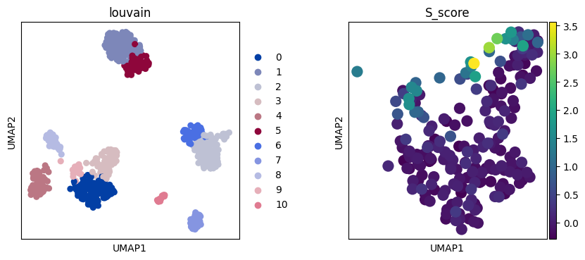
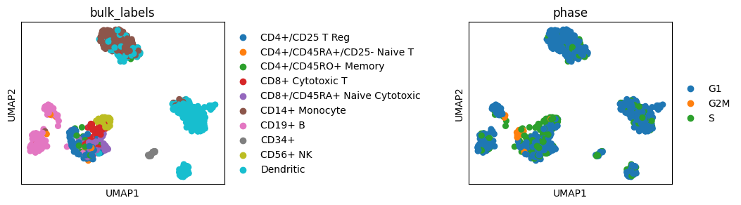
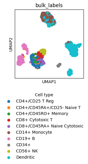
For example, from embedding plots (such as umap) we can obtain either axes (by setting show=False) or the whole figure (by setting return_fig=True) that stores axes in figure.axes. For every plotted category one Axes object will be created and for every continuous category two Axes objects: the UMAP plot and colorbar on the side. However, if we want to obtain the colorbar axes object we need to use return_fig=True rather than show=False. When accessing Axes from Figure the returned object is a list and we need to select the relevant Axes to modify them. When returning Axes directly (e.g. with show=False) we obtain either an individual Axes object (if this is the only Axes object on the Figure) or a list of Axes (if multiple Axes were created).
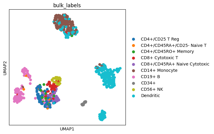
# Examples of returned objects from the UMAP function

print("Categorical plots:")
axes = sc.pl.umap(adata, color=["bulk_labels"], show=False)
print("Axis from a single category plot:", axes)
plt.close()
axes = sc.pl.umap(adata, color=["bulk_labels", "S_score"], show=False)
print("Axes list from two categorical plots:", axes)
plt.close()
fig = sc.pl.umap(adata, color=["bulk_labels"], return_fig=True)
print("Axes list from a figure with one categorical plot:", fig.axes)
plt.close()

print("\nContinous plots:")
axes = sc.pl.umap(adata, color=["IGJ"], show=False)
print("Axes from one continuous plot:", axes)
plt.close()
fig = sc.pl.umap(adata, color=["IGJ"], return_fig=True)
print("Axes list from a figure of one continous plot:", fig.axes)
plt.close()
Categorical plots:
Axis from a single category plot: Axes(0.125,0.11;0.775x0.77)
Axes list from two categorical plots: [<Axes: title={'center': 'bulk_labels'}, xlabel='UMAP1', ylabel='UMAP2'>, <Axes: title={'center': 'S_score'}, xlabel='UMAP1', ylabel='UMAP2'>]
Axes list from a figure with one categorical plot: [<Axes: title={'center': 'bulk_labels'}, xlabel='UMAP1', ylabel='UMAP2'>]

Continous plots:
Axes from one continuous plot: Axes(0.125,0.11;0.70525x0.77)
Axes list from a figure of one continous plot: [<Axes: title={'center': 'IGJ'}, xlabel='UMAP1', ylabel='UMAP2'>, <Axes: label='<colorbar>'>]
Certain plots (e.g. dotplot) are more complex, having a special plot object with multiple Axes that are used to plot different parts of the plot.
axes = sc.pl.dotplot(adata, ["CD79A", "MS4A1"], "bulk_labels", show=False)
print("Axes returned from dotplot object:", axes)
dp = sc.pl.dotplot(adata, ["CD79A", "MS4A1"], "bulk_labels", return_fig=True)
print("DotPlot object:", dp)
plt.close()
Axes returned from dotplot object: {'mainplot_ax': <Axes: >, 'size_legend_ax': <Axes: title={'center': 'Fraction of cells\nin group (%)'}>, 'color_legend_ax': <Axes: title={'center': 'Mean expression\nin group'}>}
DotPlot object: <scanpy.plotting._dotplot.DotPlot object at 0x7f4cb17b4850>
Using matplotlib Axes to customize plot alignment#
When combining multiple different plots one can pass pre-defined matplotlib Axes to some plotting functions (e.g. embedding). This can be useful when we want to have custom subplot aligmnet or want to show side by side two different plot types or two different data subsets.
Please also see the note on the show parameter above, which is required for figure rendering.
# Define matplotlib Axes
# Number of Axes & plot size
ncols = 2
nrows = 1
figsize = 4
wspace = 0.5
fig, axs = plt.subplots(
    nrows=nrows,
    ncols=ncols,
    figsize=(ncols * figsize + figsize * wspace * (ncols - 1), nrows * figsize),
)
plt.subplots_adjust(wspace=wspace)
# This produces two Axes objects in a single Figure
print("axes:", axs)

# We can use these Axes objects individually to plot on them
# We need to set show=False so that the Figure is not displayed before we
# finished plotting on all Axes and making all plot adjustments
sc.pl.umap(adata, color="louvain", ax=axs[0], show=False)
# Example zoom-in into a subset of louvain clusters
sc.pl.umap(adata[adata.obs.louvain.isin(["0", "3", "9"]), :], color="S_score", ax=axs[1])
axes: [<Axes: > <Axes: >]
We can also remove some Axes from the Figure, for example to have different number of columns per row.
matplotlib also enables more advanced Axes alignment customization, such as differently sized Axes as shown in their tutorial for GridSpec.
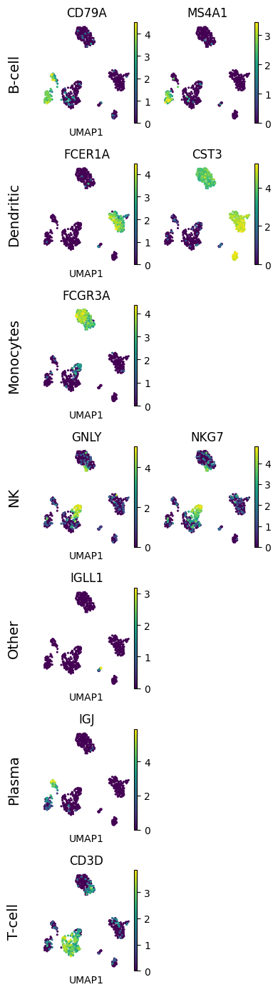
# In this example we want to show UMAPs of different cell type markers,
# with markers of a single cell type in one row
# and with a different number of markers per cell type (row)

# Marker genes
marker_genes = {
    "B-cell": ["CD79A", "MS4A1"],
    "Dendritic": ["FCER1A", "CST3"],
    "Monocytes": ["FCGR3A"],
    "NK": ["GNLY", "NKG7"],
    "Other": ["IGLL1"],
    "Plasma": ["IGJ"],
    "T-cell": ["CD3D"],
}
# Make Axes
# Number of needed rows and columns (based on the row with the most columns)
nrow = len(marker_genes)
ncol = max([len(vs) for vs in marker_genes.values()])
fig, axs = plt.subplots(nrow, ncol, figsize=(2 * ncol, 2 * nrow))
# Plot expression for every marker on the corresponding Axes object
for row_idx, (cell_type, markers) in enumerate(marker_genes.items()):
    col_idx = 0
    for marker in markers:
        ax = axs[row_idx, col_idx]
        sc.pl.umap(adata, color=marker, ax=ax, show=False, frameon=False, s=20)
        # Add cell type as row label - here we simply add it as ylabel of
        # the first Axes object in the row
        if col_idx == 0:
            # We disabled axis drawing in UMAP to have plots without background and border
            # so we need to re-enable axis to plot the ylabel
            ax.axis("on")
            ax.tick_params(
                top="off",
                bottom="off",
                left="off",
                right="off",
                labelleft="on",
                labelbottom="off",
            )
            ax.set_ylabel(cell_type + "\n", rotation=90, fontsize=14)
            ax.set(frame_on=False)
        col_idx += 1
    # Remove unused column Axes in the current row
    while col_idx < ncol:
        axs[row_idx, col_idx].remove()
        col_idx += 1
# Alignment within the Figure
fig.tight_layout()
Plot size#
There are multiple options for adjusting plot size, as shown below.
We can adjust plot size by setting rcParams['figure.figsize'], which will also change settings for future plots.
These are either available through scanpy’s set_figure_params() which wraps Matplotlib’s rcParams or by modifying them directly.
rcParams["figure.figsize"] = (2, 2)
sc.pl.umap(adata, color="bulk_labels")
# Set back to value selected above
rcParams["figure.figsize"] = FIGSIZE
We can set rcParams for a single plot with a context manager which won’t change the setting for future plots.
with plt.rc_context({"figure.figsize": (5, 5)}):
    sc.pl.umap(adata, color="bulk_labels")
We can also create an Axes object with a predefined size and pass it to a scanpy plotting function.
fig, ax = plt.subplots(figsize=(4, 4))
sc.pl.umap(adata, color="bulk_labels", ax=ax)
The figsize is divided between all Axes and spaces between them. Thus, if we have multiple Axes (columns or rows) we must accordingly increase figsize.
However, if we do not pass Axes objects to the scanpy embedding function it will automatically create individual Axes with the size of the current global figsize (as specified by e.g. matplotlib figure.figsize).
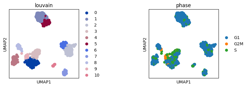
ncol = 2
nrow = 1
figsize = 3
wspace = 1
# Adapt figure size based on number of rows and columns and added space between them
# (e.g. wspace between columns)
fig, axs = plt.subplots(nrow, ncol, figsize=(ncol * figsize + (ncol - 1) * wspace * figsize, nrow * figsize))
plt.subplots_adjust(wspace=wspace)
sc.pl.umap(adata, color="louvain", ax=axs[0], show=False)
sc.pl.umap(adata, color="phase", ax=axs[1])
Adjust space between subplots#
When plotting multiple plots (e.g. with embedding) in the same row or column it may happen that the legend overlaps with the neighbouring plot. This can be overcomed by setting wspace (width) or hspace (height). These parameters can be likewise used when creating Axes for plotting (see the above section on using matplotlib Axes).
# Default, legend is overlapping
sc.pl.umap(adata, color=["bulk_labels", "phase"])
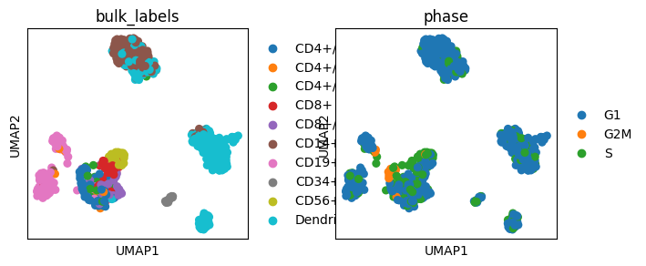
# Increase gap size between plots
sc.pl.umap(adata, color=["bulk_labels", "phase"], wspace=1)
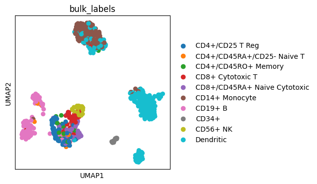
Adapt axes appearance#
We can further modify the plot object (e.g. Axes) to change axis text, title size, font type (e.g. italic), font color, etc. For further details on customizing Axes and Figure objects see matplotlib documentation.
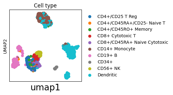
Some scanpy plotting functions already have predefined parameters for adjusting plot appearance. For example, embedding enables setting of titles with the title parameter and transparent plotting with the frameon parameter.
# Set title with the title parameter
# Return Axes to further modify the plot
ax = sc.pl.umap(adata, color="bulk_labels", title="Cell type", show=False)
# Modify xlabel
_ = ax.set_xlabel("umap1", fontsize=20)
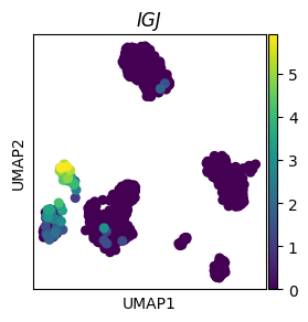
# Make title italic
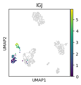
ax = sc.pl.umap(adata, color="IGJ", show=False)
_ = ax.set_title("IGJ", style="italic")
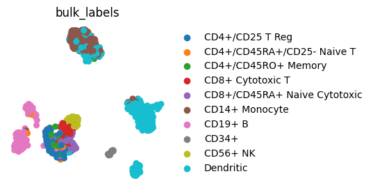
# Transparent background and no borders/axis labels with frameon=False
sc.pl.umap(adata, color="bulk_labels", frameon=False)
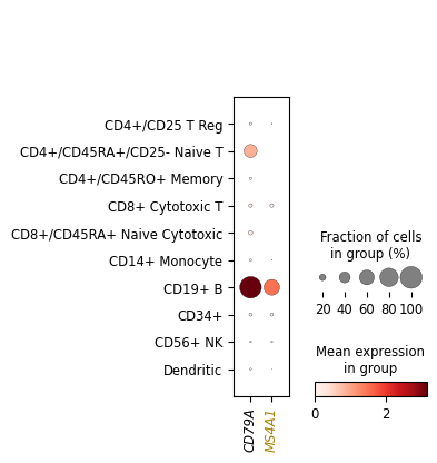
We can also change appearance (e.g color) of individual axis labels. This may be of special interest for plots like dotplot where we show multiple genes or cell groups and we want to highlight some of them.
dp = sc.pl.dotplot(adata, ["CD79A", "MS4A1"], "bulk_labels", show=False)
# All Axes used in dotplot
print("Dotplot axes:", dp)
# Select the Axes object that contains the subplot of interest
ax = dp["mainplot_ax"]
# Loop through ticklabels and make them italic
for l in ax.get_xticklabels():
    l.set_style("italic")
    g = l.get_text()
    # Change settings (e.g. color) of certain ticklabels based on their text (here gene name)
    if g == "MS4A1":
        l.set_color("#A97F03")
Dotplot axes: {'mainplot_ax': <Axes: >, 'size_legend_ax': <Axes: title={'center': 'Fraction of cells\nin group (%)'}>, 'color_legend_ax': <Axes: title={'center': 'Mean expression\nin group'}>}
Labels and legends#
Customizing legends#
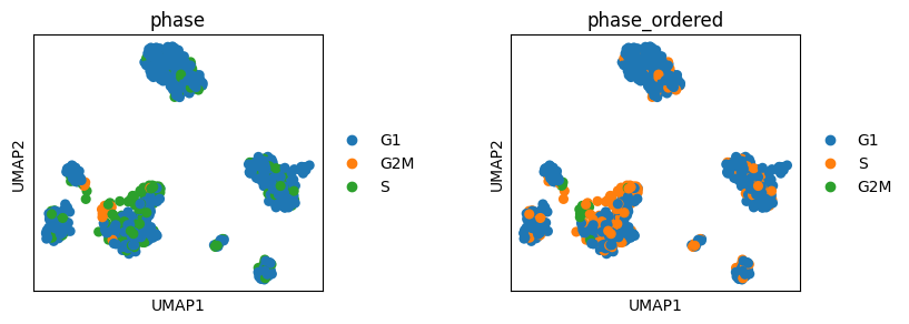
We can define order of groups in scanpy legend by setting order of groups (categories) in the corresponding obs column in the pandas DataFrame.
# The default ordering of cell cycle phases is alphabetical
# To ensure that the ordering corresponds to cell cycle define order of categories;
# this should include all categories in the corresponding pandas table column
phases = ["G1", "S", "G2M"]
adata.obs["phase_ordered"] = pd.Categorical(values=adata.obs.phase, categories=phases, ordered=True)
sc.pl.umap(adata, color=["phase", "phase_ordered"], wspace=0.5)
# This just removes the newly added ordered column from adata as we do not need it below
del adata.obs["phase_ordered"]
Change the Legend title and move the Legend to a different location
fig = sc.pl.umap(adata, color=["bulk_labels"], return_fig=True)
ax = fig.axes[0]
ax.legend_.set_title("Cell type")
# Change Legend location
ax.legend_.set_bbox_to_anchor((-0.2, -0.7))
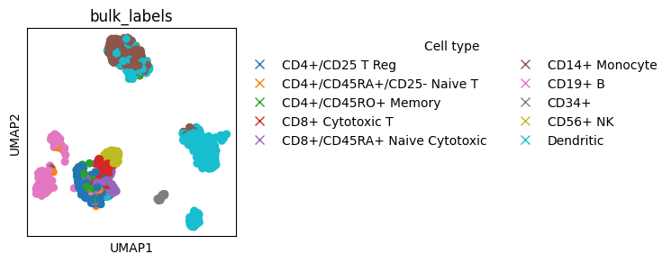
Make a customized Legend by replacing the Legend instance in the plot.
In case we want to add multiple Legend instances we need to use plt.gca().add_artist(legend) (shown in one of the below sections).
from matplotlib.lines import Line2D


fig = sc.pl.umap(adata, color=["bulk_labels"], return_fig=True)
ax = fig.axes[0]
# Remove original Legend
ax.legend_.remove()
# Make new Legend
l1 = ax.legend(
    # Add Legend element for each color group
    handles=[
        # Instead of Line2D we can also use other matplotlib objects, such as Patch, etc.
        Line2D(
            [0],
            [0],
            marker="x",
            color=c,
            lw=0,
            label=l,
            markerfacecolor=c,
            markersize=7,
        )
        # Color groups in adata
        for l, c in zip(list(adata.obs.bulk_labels.cat.categories), adata.uns["bulk_labels_colors"], strict=True)
    ],
    # Customize Legend outline
    # Remove background
    frameon=False,
    # Make more Legend columns
    ncols=2,
    # Change location to not overlap with the plot
    bbox_to_anchor=(1, 1),
    # Set title
    title="Cell type",
)
Annotating scatter plots#
We can plot ontop of already created plots to mark objects.
Here we show how to encircle a single object on the plot and then add a new Legend to explain the mark.
fig, ax = plt.subplots(figsize=(3, 3))
sc.pl.umap(adata, color=["bulk_labels"], ax=ax, show=False)

# Encircle part of the plot

# Find location on the plot where circle should be added
location_cells = adata[adata.obs.bulk_labels == "CD56+ NK", :].obsm["X_umap"]
x = location_cells[:, 0].mean()
y = location_cells[:, 1].mean()
size = 1.5  # Set circle size
# Plot circle
circle = plt.Circle((x, y), size, color="k", clip_on=False, fill=False)
ax.add_patch(circle)

# Add annother Legend for the mark

# Save the original Legend
l1 = ax.get_legend()
l1.set_title("Cell type")
# Make a new Legend for the mark
l2 = ax.legend(
    handles=[
        Line2D(
            [0],
            [0],
            marker="o",
            color="k",
            markerfacecolor="none",
            markersize=12,
            markeredgecolor="k",
            lw=0,
            label="selected",
        )
    ],
    frameon=False,
    bbox_to_anchor=(3, 1),
    title="Annotation",
)
# Add back the original Legend which was overwritten by the new Legend
_ = plt.gca().add_artist(l1)
We can also use external packages, such as adjustText, to help us mark objects on plots.
adjustText enables annotation of multiple nearby plot locations while minimising text overlap.
# Package used for adding well aligned labels on the plot
from adjustText import adjust_text


with plt.rc_context({"figure.figsize": (5, 5)}):
    x = "means"
    y = "dispersions"
    color = "is_highly_variable"
    adata.var["is_highly_variable"] = adata.var["highly_variable"].astype(bool).astype(str)
    ax = sc.pl.scatter(adata, x=x, y=y, color=color, show=False)
    print("Axes:", ax)
    # Move plot title from Axes to Legend
    ax.set_title("")
    ax.get_legend().set_title(color)

    # Labels

    # Select genes to be labeled
    texts = []
    genes = [
        "CD79A",
        "MS4A1",
        "FCER1A",
        "CST3",
        "FCGR3A",
        "GNLY",
        "NKG7",
        "IGLL1",
        "IGJ",
        "CD3D",
    ]
    for gene in genes:
        # Position of object to be marked
        x_loc = adata.var.loc[gene, x]
        y_loc = adata.var.loc[gene, y]
        # Text color
        color_point = "k"
        texts.append(ax.text(x_loc, y_loc, gene, color=color_point, fontsize=10))

    # Label selected genes on the plot
    _ = adjust_text(
        texts,
        expand=(1.2, 1.2),
        arrowprops=dict(color="gray", lw=1),
        ax=ax,
    )
Axes: Axes(0.146628,0.15;0.568915x0.73)
Further examples are discussed here.
Colors#
Here we show how to define colors in scanpy and collected some recommendations on color palettes.
Discrete palettes#
We can define colors for individual categories in scanpy with a dictionary.
sc.pl.umap(
    adata,
    color="phase",
    s=20,
    palette={"S": "tab:cyan", "G1": "tab:olive", "G2M": "tab:red"},
)
While matplotlib offers various discrete palettes, it may be hard to find large palettes where colors can be easily distinguished. Tools such as glasbey enable creation of large discrete palettes where colors can be visually well distinguished. It also supports hierarchical palettes.
Continous palettes#
For non-centered values we recommend virids palettes as they are perceptually uniform and colorblind friendly. For centered values we recommend diverging palettes, where the center of the palette should be set to match the center value (e.g. 0).
We can center a diverging palette in scanpy with vcenter. Alternatively, we can use vmin and vmax to make the palette symmetric.
# Center palette with vcenter

# Make mock column for plotting, here we use random values from normal distribution
loc = 0
adata.obs["normal"] = rng.normal(loc=loc, size=adata.shape[0])

# Center at mean (loc) of the distribution with vcenter parameter
sc.pl.umap(adata, color="normal", cmap="coolwarm", s=20, vcenter=loc)
del adata.obs["normal"]
# Make symmetric palette with vmin and vmax
# Make mock column for plotting, here we use B cell score
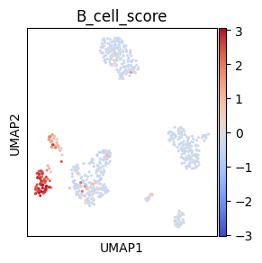
sc.tl.score_genes(adata, ["CD79A", "MS4A1"], score_name="B_cell_score")
# To make a symmetric palette centerd around 0 we set vmax to maximal absolut value and vmin to
# the negative value of maxabs
maxabs = max(abs(adata.obs["B_cell_score"]))
sc.pl.umap(adata, color="B_cell_score", cmap="coolwarm", s=20, vmin=-maxabs, vmax=maxabs)
del adata.obs["B_cell_score"]
matplotlib also supports custom color palettes with scaling (e.g. log), value range normalisation, centering, and custom color combinations or dynamic ranges.
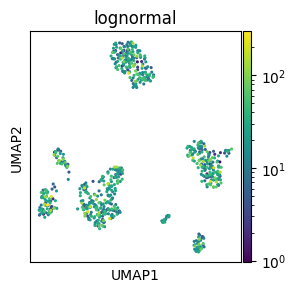
# Log-scaled palette

# Make mock column with log-normally distirbuited values
adata.obs["lognormal"] = rng.lognormal(3, 1, adata.shape[0])

# Log scaling of the palette
norm = mcolors.LogNorm()
sc.pl.umap(adata, color="lognormal", s=20, norm=norm)

del adata.obs["lognormal"]
if TYPE_CHECKING:
from numpy.typing import ArrayLike
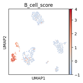
# Centered non-symmetric palette
# Make mock column for plotting, here we use B cell score
sc.tl.score_genes(adata, ["CD79A", "MS4A1"], score_name="B_cell_score")
# Palette normalization with centering and adapted dynamic range to correspond to
# the distance of vmin and vmax from the cenetr
# Adapted from https://stackoverflow.com/a/50003503
class MidpointNormalize(mcolors.Normalize):
vmin: float
vmax: float
midpoint: float
def __init__(
self, vmin: float | None = None, vmax: float | None = None, *, midpoint: float = 0, clip: bool = False
) -> None:
self.midpoint = midpoint
super().__init__(vmin, vmax, clip=clip)
def __call__(self, value: ArrayLike, clip: object = None) -> np.ma.MaskedArray:
del clip
value = np.array(value).astype(float)
normalized_min = max(
0.0,
0.5 * (1.0 - abs((self.midpoint - self.vmin) / (self.midpoint - self.vmax))),
)
normalized_max = min(
1.0,
0.5 * (1.0 + abs((self.vmax - self.midpoint) / (self.midpoint - self.vmin))),
)
normalized_mid = 0.5
x, y = (
[self.vmin, self.midpoint, self.vmax],
[normalized_min, normalized_mid, normalized_max],
)
return np.ma.masked_array(np.interp(value, x, y))
# Add padding arround vmin and vmax as Colorbar sets value limits to round numbers below and
# above the vmin and vmax, respectively, which means that they can not be assigned the correct
# color with our nomalisation function that is limited to vmin and vmax
# However, this padding reduces the dynamic range as we set a broad padding and
# then later discard values that are not needed for the rounding up and down
# of the vmin and vmax on the Colorbar, respectively
vmin = adata.obs["B_cell_score"].min()
vmax = adata.obs["B_cell_score"].max()
vpadding = (vmax - vmin) * 0.2
norm = MidpointNormalize(vmin=vmin - vpadding, vmax=vmax + vpadding, midpoint=0)
# Plot umap
fig = sc.pl.umap(
adata,
color="B_cell_score",
cmap="coolwarm",
s=20,
norm=norm,
return_fig=True,
show=False,
)
# Adjust Colorbar ylim to be just outside of vmin,vmax and not far outside of this range
# as the padding we set initially may be too broad
cmap_yticklabels = np.array([t.get_position()[1] for t in fig.axes[1].get_yticklabels()])
fig.axes[1].set_ylim(
max(cmap_yticklabels[cmap_yticklabels < vmin]),
min(cmap_yticklabels[cmap_yticklabels > vmax]),
)
del adata.obs["B_cell_score"]
Colorblind friendly palettes#
There are different resources that allow creation of colorblind friendly palettes. Example python packages are continous virids palettes and discrete bokeh palettes. Some tools to help you assess whether your palette is color blind friendly include:
Coloring for Colorblindness is a web based tool which can simulate different kinds of color blindness for a discrete palette
Color Oracle a downloadable app which applies a color blindness filter to your screen
UMAP#
This section shows some umap() (and embedding()) specific tips.
Coloring cell subset#
Here we show how we can plot all cells as a background and then plot on top indivdual cell groups in color.
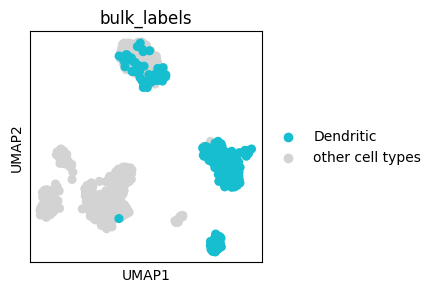
We can color-in only specific cell groups when using categorical colors with the groups parameter.
ax = sc.pl.umap(adata, color=["bulk_labels"], groups=["Dendritic"], show=False)

# We can change the 'NA' in the legend that represents all cells outside of the
# specified groups
legend_texts = ax.get_legend().get_texts()
# Find legend object whose text is "NA" and change it
for legend_text in legend_texts:
    if legend_text.get_text() == "NA":
        legend_text.set_text("other cell types")
We can also plot continous values of an individual cell group using the obs_mask key word argument:
sc.pl.umap(adata, color="IGJ", mask_obs=(adata.obs.bulk_labels == "CD19+ B"), size=20)
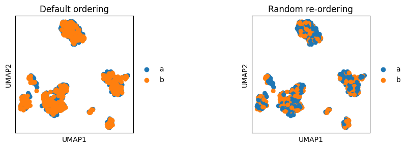
Cell ordering#
embedding allows sorting based on continous value to plot cells with the highest score on top (parameter sort_order). However, for categorical values embedding currently does not offer special ordering parameters. Instead, the cells are plotted in the same order as they are stored in the AnnData. Thus, for example, when we concatente two AnnData objects of two batches and we want to visualise the location of batches, one of the batches will be plotted ontop of the other batch. Thus we first need to reorder cells to ensure that both batches will be visible.
# Make two batches in the adata object for the plot example
adata.obs["batch"] = ["a"] * int(adata.shape[0] / 2) + ["b"] * (adata.shape[0] - int(adata.shape[0] / 2))

fig, axs = plt.subplots(1, 2, figsize=(9, 3))
plt.subplots_adjust(wspace=1)
sc.pl.umap(adata, color="batch", ax=axs[0], title="Default ordering", show=False)
# Randomly order cells by making a random index and subsetting AnnData based on it
# Set a random seed to ensure that the cell ordering will be reproducible
random_indices = np.random.default_rng(0).permutation(list(range(adata.shape[0])))
sc.pl.umap(adata[random_indices, :], color="batch", ax=axs[1], title="Random re-ordering")
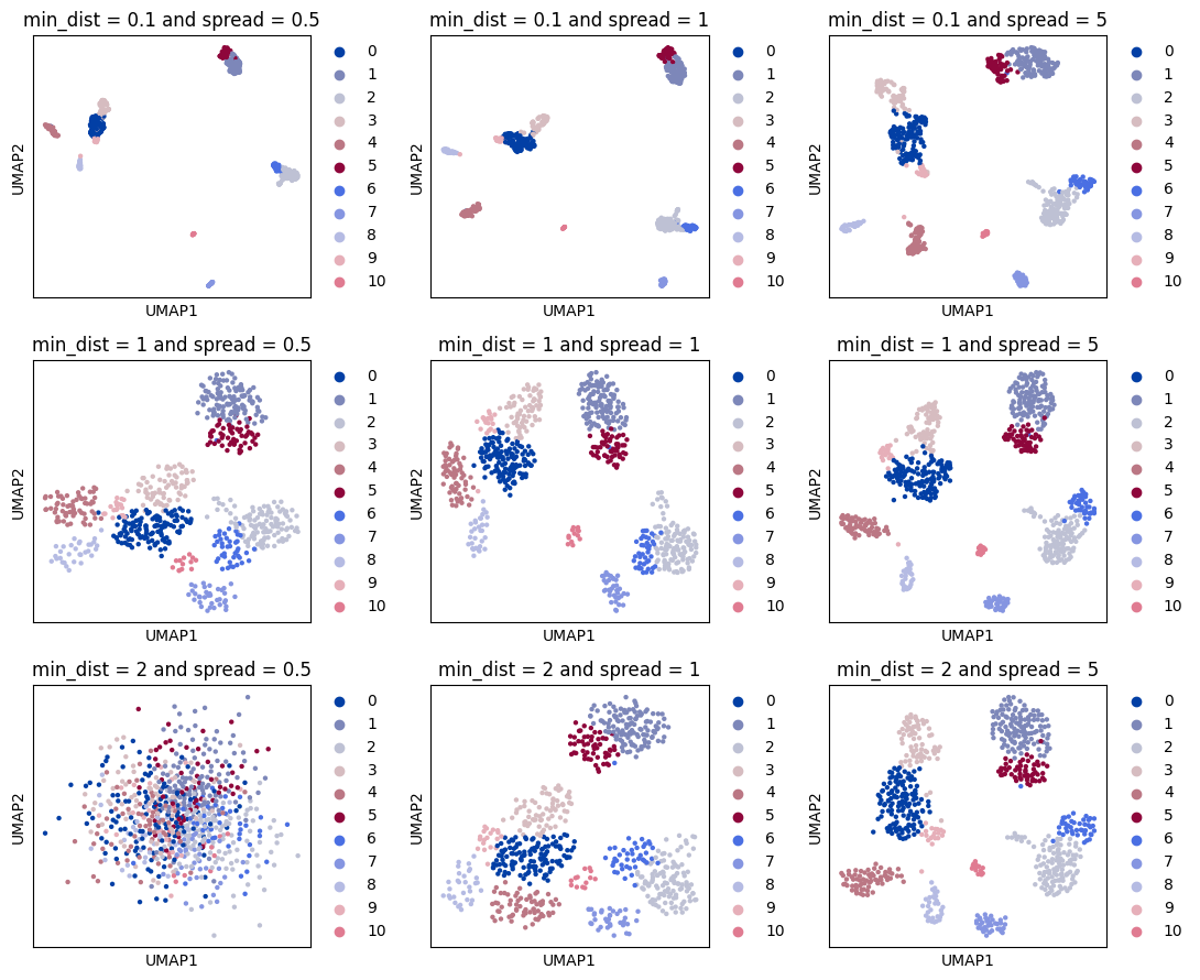
Optimising UMAP layout#
UMAP layout can be modified to make cells located in more tight or dispersed structures. This can be regulated with the sc.tl.umap parameters min_dist and spread. Below we show UMAP exaples computed with different parameter combinations.
from itertools import product


# Copy adata not to modify UMAP in the original adata object
adata_temp = adata.copy()
# Loop through different umap parameters, recomputting and replotting UMAP for each of them
MIN_DISTS = [0.1, 1, 2]
SPREADS = [0.5, 1, 5]
# Create grid of plots, with a little extra room for the legends
fig, axes = plt.subplots(len(MIN_DISTS), len(SPREADS), figsize=(len(SPREADS) * 3 + 2, len(MIN_DISTS) * 3))

for (i, min_dist), (j, spread) in product(enumerate(MIN_DISTS), enumerate(SPREADS)):
    ax = axes[i][j]
    param_str = " ".join(["min_dist =", str(min_dist), "and spread =", str(spread)])
    # Recompute UMAP with new parameters
    sc.tl.umap(adata_temp, min_dist=min_dist, spread=spread)
    # Create plot, placing it in grid
    sc.pl.umap(
        adata_temp,
        color=["louvain"],
        title=param_str,
        s=40,
        ax=ax,
        show=False,
    )
plt.tight_layout()
plt.show()
plt.close()
del adata_temp
PAGA#
sc.tl.paga(adata, groups="louvain")
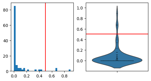
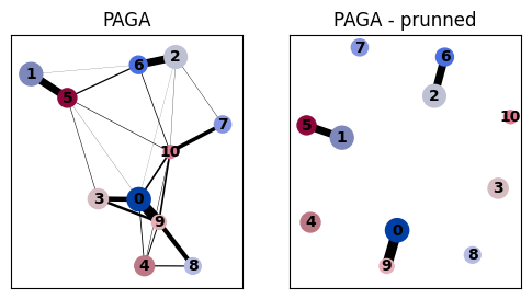
Prune PAGA edges#
Remove weak PAGA edges in the plot based on edge weight distribution.
This is based on the assumption that most edge weights will be relatively weak and that we can therefore spot the few most interesting edges as the outliers of the distribution.
# Distribution of PAGA connectivities for determining the cutting threshold
fig, axs = plt.subplots(1, 2, figsize=(6, 3))
paga_conn = adata.uns["paga"]["connectivities"].toarray().ravel()
a = axs[0].hist(paga_conn, bins=30)
sns.violinplot(paga_conn, ax=axs[1], inner=None)
sns.swarmplot(paga_conn, ax=axs[1], color="k", size=1)
thr = 0.5
_ = axs[1].axhline(thr, c="r")
_ = axs[0].axvline(thr, c="r")
# Compare PAGA with and without prunning
fig, axs = plt.subplots(1, 2, figsize=(6, 3))
sc.pl.paga(adata, ax=axs[0], title="PAGA", show=False)
sc.pl.paga(adata, ax=axs[1], title="PAGA - prunned", threshold=thr)
PAGA layout#
The layout used in PAGA is optimised to correspond to the PAGA connectivties (edge weighs). However, sometimes we would wish to have a different layout. For this we can use the pos argument.
PAGA layout corresponding to UMAP#
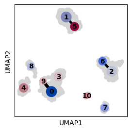
Set PAGA dot centers to the mean of the UMAP embedding values of cells from the corresponding groups.
# Compare UMAP and PAGA layouts
fig, axs = plt.subplots(1, 2, figsize=(6, 3))
sc.pl.umap(adata, color="louvain", ax=axs[0], show=False, title="UMAP", legend_loc="on data")
sc.pl.paga(adata, ax=axs[1], title="PAGA")
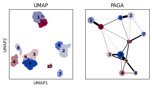
# Define PAGA positions based on the UMAP layout -
# for each cluster we use the mean of the UMAP positions from the cells in that cluster
pos = pd.DataFrame(adata.obsm["X_umap"], index=adata.obs_names)
pos["group"] = adata.obs[adata.uns["paga"]["groups"]]
pos = pos.groupby("group", observed=True).mean()

# Plot UMAP in the background
ax = sc.pl.umap(adata, show=False)
# Plot PAGA ontop of the UMAP
sc.pl.paga(
    adata,
    color="louvain",
    threshold=thr,
    node_size_scale=1,
    edge_width_scale=0.7,
    pos=pos.values,
    random_state=0,
    ax=ax,
)